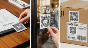
QR Code Stickers Australia
QR Code Stickers Australia: Smart Solutions for Business Growth In just three short years, Australia has witnessed a digital revolution that transformed how businesses interact

Creating effective custom stickers requires balancing aesthetic appeal with functional requirements while ensuring designs translate successfully from digital concepts to physical products. Understanding fundamental design principles specific to sticker applications can mean the difference between professional results that achieve marketing objectives and costly mistakes that waste resources while failing to deliver intended impact.
Simplicity forms the foundation of successful sticker design, particularly important given the typically brief viewing opportunities and diverse application environments stickers encounter. Complex designs with excessive detail often become cluttered and illegible when reproduced at small sizes or viewed from typical distances. Professional sticker design principles emphasize clarity and immediate recognition over intricate artistic elements that may look impressive on computer screens but fail to communicate effectively in real-world applications.
Effective sticker designs employ visual hierarchy principles that guide viewers’ attention through design elements in predetermined sequences. Primary elements like logos or headlines should dominate compositions through size, color, or positioning, while secondary information supports main messages without competing for attention. This structured approach ensures key information communicates effectively even during brief viewing opportunities common in retail environments or vehicle applications.
Color considerations extend beyond aesthetic preferences to encompass practical factors that significantly impact functionality and perception. Brand color consistency requires precise color matching using Pantone reference systems that ensure accurate reproduction across different printing runs and material types. Technical printing standards specify proper color management workflows that maintain consistency from digital design files through final printed products.
Contrast optimization ensures readability across diverse application surfaces and lighting conditions. High contrast between text elements and backgrounds improves legibility, particularly important for informational stickers or safety applications where clear communication is essential. Dark text on light backgrounds typically provides optimal readability, though reverse configurations can work effectively when contrast ratios remain sufficient for easy reading.
Background surface considerations influence color selection and contrast requirements, as stickers often apply to surfaces with existing colors or patterns that could interfere with design visibility. Light-colored stickers may disappear against white surfaces while dark designs could become invisible on black applications. Understanding intended application environments helps designers select colors that maintain visibility and impact regardless of background variations.
Typography represents critical design elements that directly impact communication effectiveness and professional appearance. Font selection should prioritize readability over decorative appeal, particularly for informational content or small-format applications where legibility becomes challenging. Sans-serif typefaces generally perform better than serif alternatives in sticker applications due to cleaner reproduction at small sizes and improved readability from typical viewing distances.
Text sizing must account for viewing distances and application contexts to ensure information remains readable throughout intended service life. Minimum text sizes vary depending on font selection and contrast levels, but general guidelines suggest avoiding text smaller than 6-8 points for critical information. Headers and key messages benefit from significantly larger sizing that creates visual impact while ensuring readability even in challenging viewing conditions.
Text hierarchy techniques help organize information logically while creating visually appealing compositions. Primary headlines should dominate through size and positioning, while secondary information uses smaller fonts that remain clearly subordinate to main messages. Consistent spacing and alignment create professional appearances that enhance credibility and perceived value.
Technical requirements for artwork preparation significantly impact final quality and production efficiency. Resolution specifications demand minimum 300 DPI for all design elements to ensure sharp reproduction without pixelation or quality degradation. Professional artwork guidelines establish industry standards that prevent common technical problems while optimizing production workflows.
Bleed areas represent essential technical considerations that prevent white edges or incomplete coverage around sticker perimeters. Professional printing requires design elements to extend beyond final cut lines, typically 1-3mm depending on size and production methods. This seemingly minor detail prevents costly reprints and ensures professional finished appearance.
Safety zones protect important design elements from potential trimming variations during die-cutting processes. Critical text, logos, or other essential elements should remain at least 3-5mm from final cut edges to ensure they survive normal production tolerances without damage or partial removal.
Shape optimization requires designing with intended final shapes in mind rather than treating custom shapes as afterthoughts. Design elements should complement and enhance shape selections rather than fighting against them. Circular stickers benefit from centered, radial designs while complex custom shapes may require elements that follow or contrast with perimeter configurations.
Die-cutting considerations affect both design feasibility and production costs. Very small details, thin connecting elements, or sharp internal corners may be difficult or impossible to cut accurately, requiring design modifications that maintain visual impact while ensuring reliable production. Understanding these limitations early in design process prevents disappointment and additional revision costs.
Scalability planning ensures designs work effectively across different size requirements without losing essential details or becoming illegibly small. Vector-based design approaches maintain quality at any scale while raster images may require different treatments for various size applications. Testing designs at intended final sizes helps identify potential problems before production commitments.
File preparation protocols ensure smooth transitions from design concepts to finished products. Accepted file formats typically include vector formats like PDF, EPS, or AI for scalable designs, while high-resolution raster formats may work for photographic elements. Color mode specifications require CMYK setups for accurate print reproduction, as RGB color spaces used by computer monitors don’t translate directly to printing processes.
Vector versus raster considerations affect both design approaches and final quality outcomes. Vector graphics provide unlimited scalability and precise color control while raster images offer photographic realism but may limit sizing flexibility. Understanding when to use each approach optimizes both design effectiveness and production efficiency.
Quality control measures during design phase prevent expensive corrections during production. Proofing procedures including color accuracy checks, text proofing, and scale verification help identify potential issues before manufacturing commitments. Many professional sticker providers offer proofing services that show actual printed samples before final production runs.
Design consultation services can provide valuable expertise for businesses or individuals lacking graphic design experience. Professional design assistance can transform basic concepts into production-ready artwork while avoiding common mistakes that compromise effectiveness or increase costs.
The investment in proper design development pays dividends through improved marketing effectiveness, enhanced professional reputation, and reduced likelihood of costly reprints or design failures that waste time and resources while potentially damaging brand perception.
QR Code Stickers Australia: Smart Solutions for Business Growth In just three short years, Australia has witnessed a digital revolution that transformed how businesses interact

The Complete Guide to Candle Labels: Design, Materials & Australian Compliance Australia’s candle market is experiencing unprecedented growth, with handcrafted and artisanal candles driving a $200+

The Aussie Choice for a Greener Tomorrow Eco-friendly stickers are no longer a niche choice—they’re quickly becoming the go-to for Aussie businesses and event organisers

Choosing the Perfect Sticker Type for Your Project: A Quick Guide Picking the right sticker can make or break your project. Many get stuck choosing

Harnessing Gippsland’s Printing Expertise for Australian Business Success Most Australian businesses settle for slow, generic printing from big companies. You don’t have to. Gippsland printing