
QR Code Stickers Australia
QR Code Stickers Australia: Smart Solutions for Business Growth In just three short years, Australia has witnessed a digital revolution that transformed how businesses interact

Australia’s candle market is experiencing unprecedented growth, with handcrafted and artisanal candles driving a $200+ million industry that shows no signs of slowing down. From weekend hobbyists selling at local farmers’ markets to established brands expanding their reach across the continent, candle makers are discovering that success hinges on more than just perfect wax blends and captivating fragrances.
Your product label is often the first—and most lasting—impression customers have of your brand. Yet surprisingly, many talented candle makers pour their hearts into perfecting their craft while treating labels as an afterthought, a necessary but mundane detail to be handled quickly and cheaply. This approach couldn’t be more misguided.
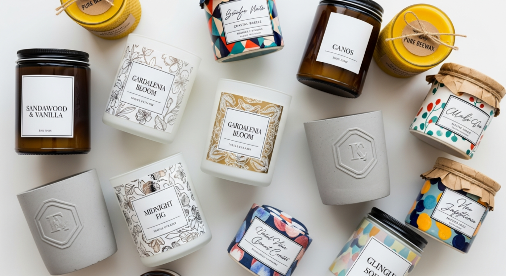
The reality is that your candle label is working 24/7 as a silent salesperson, communicating your brand’s story, quality, and values to potential customers before they’ve even lifted the lid to experience your carefully crafted scents. In Australia’s increasingly competitive candle market, where consumers have countless options both online and in retail stores, a professional, well-designed label can be the difference between a product that sits forgotten on shelves and one that becomes a customer favorite.
This comprehensive guide will fundamentally transform how you approach candle labeling, taking you on a journey from basic compliance requirements to advanced design principles that elevate your brand. You’ll discover the technical intricacies of material selection that ensure your labels maintain their professional appearance throughout the product lifecycle, master the art of visual hierarchy and typography that guides customer attention exactly where you want it, and learn the insider secrets that separate amateur-looking products from premium brands that command higher prices and customer loyalty.
Whether you’re launching your first candle line or refining an existing product range, the strategies outlined in this guide will help you create labels that not only meet Australia’s legal requirements but also enhance your brand’s story and drive measurable sales growth. We’ll explore everything from heat-resistant materials that withstand the unique challenges of candle applications to the psychology of color choices that influence purchasing decisions, ensuring you have the knowledge and confidence to make informed decisions that protect and grow your business.
Navigating the regulatory landscape of Australian candle labeling might initially seem daunting, but understanding these requirements is essential for protecting both your customers and your business from potentially devastating liability issues. While Australia doesn’t have specific mandatory standards exclusively for candle labels, this doesn’t mean you’re operating in a regulation-free environment—quite the opposite.
The Australian Consumer Law (ACL) and Australian Competition and Consumer Commission (ACCC) regulations cast a wide net over all consumer products, including candles, requiring that products be safe, accurately described, and genuinely fit for their intended purpose. Australian Consumer Law compliance requirements provide comprehensive guidance that applies to all consumer goods, establishing a framework that smart candle makers use as a competitive advantage rather than viewing as a bureaucratic burden.
What many candle makers don’t realize is that the voluntary standard AS/NZS 4013:2014 provides incredibly valuable, comprehensive safety guidelines specifically designed for candle design and labeling. While adherence isn’t legally mandated, following these guidelines demonstrates professional responsibility and can provide crucial protection in the unlikely event of customer complaints or safety incidents. Insurance companies and legal professionals often look favorably upon businesses that voluntarily exceed minimum requirements, potentially reducing liability exposure and insurance premiums.
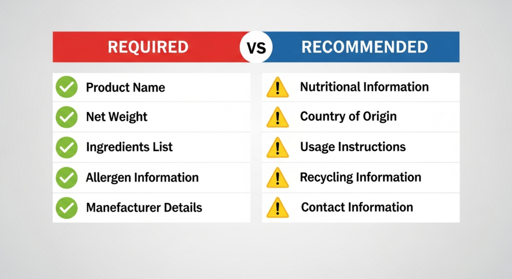
Essential safety information forms the backbone of responsible candle labeling, and getting this right builds immediate customer trust while protecting your business. Wick trimming instructions should clearly recommend keeping wicks trimmed to approximately 5mm before each use—this simple guidance prevents excessive smoking, reduces fire risk, and significantly extends your candle’s burn time, creating happier customers who are more likely to repurchase. Maximum burn time guidance helps customers understand safe usage patterns; most experts recommend limiting continuous burning to 3-4 hours, allowing the wax pool to solidify before relighting.
Heat-resistant surface warnings represent another critical safety consideration that many new candle makers overlook. Clearly stating that candles should be placed on heat-resistant surfaces away from flammable materials isn’t just about liability protection—it’s about demonstrating that you care about your customers’ safety and home security. This type of thoughtful safety guidance positions your brand as professional and trustworthy, qualities that justify premium pricing and encourage word-of-mouth recommendations.
For scented candles, allergen disclosure requirements add another layer of consideration, particularly for products containing known sensitizers or common allergens. While specific disclosure requirements for candles aren’t as stringent as those for cosmetics or food products, proactively listing major allergens demonstrates transparency and helps customers make informed decisions. This is especially important for customers with sensitivities or when marketing candles as gifts, where the purchaser may not know the end user’s sensitivities.
Clear usage instructions extend beyond basic safety to encompass proper care that maximizes your product’s performance and customer satisfaction. Instructions about proper storage, optimal burning environments, and troubleshooting common issues like tunneling or excessive soot show customers that you’re invested in their experience with your product. This attention to detail often translates directly into positive reviews, repeat purchases, and referrals to friends and family.
The intersection of compliance and marketing becomes particularly powerful when you realize that customers increasingly prefer brands that demonstrate responsibility and transparency. Fast Stickers’ food label guide offers valuable insights into compliance challenges that share many regulatory principles with candle labeling, showing how other industries successfully balance legal requirements with compelling marketing messages.
Understanding compliance isn’t just about avoiding problems—it’s about building a foundation of trust that allows your brand to flourish in Australia’s competitive marketplace. This compliance foundation becomes the bedrock upon which all other labeling decisions are built, leading naturally into the critical consideration of selecting materials that can withstand the unique challenges of candle applications while maintaining the professional appearance that conveys trustworthiness to potential customers.
The material you choose for your candle labels will ultimately determine whether your carefully crafted design maintains its professional appearance throughout the product’s lifecycle or becomes a source of embarrassment as labels peel, fade, or deteriorate. Unlike products that sit safely on shelves in controlled environments, candles face unique challenges that can quickly expose inferior labeling materials and damage your brand’s reputation.
Temperature fluctuations represent one of the most significant challenges facing candle labels. During shipping, products may sit in hot vehicles or storage facilities where temperatures can soar, while retail environments often experience significant daily temperature variations. Even in customer homes, candles are frequently stored in areas like laundries, bathrooms, or seasonal storage spaces where temperature and humidity levels fluctuate dramatically. Your label material must withstand these conditions without warping, bubbling, or losing adhesion.
Vinyl labels have emerged as the gold standard for professional candle applications, and for compelling technical reasons. With temperature resistance ranging from -46°C to +65°C, vinyl labels maintain their integrity across the extreme temperature ranges your products are likely to encounter during their entire lifecycle. This impressive temperature range means vinyl labels won’t crack in cold storage or bubble and peel in hot shipping containers—performance characteristics that cheaper materials simply cannot match.
The oil resistance properties of vinyl labels prove equally crucial for candle applications. Essential oils used in scenting can gradually seep through wax and interact with label materials, causing some adhesives to fail or paper substrates to stain and degrade. Vinyl’s non-porous surface creates an effective barrier against oil penetration, ensuring your labels maintain their appearance even when exposed to the aromatic compounds that make your candles appealing. Fast Stickers vinyl sticker range offers heat and oil-resistant vinyl options specifically engineered for challenging applications like candle labeling.
Beyond technical performance, vinyl labels offer aesthetic versatility that allows you to match your material choice to your brand positioning. Glossy vinyl finishes enhance color vibrancy and provide easy cleaning, making them ideal for modern, sophisticated brands that want their products to appear fresh and premium on retail shelves. The enhanced color saturation possible with glossy vinyl makes photographs and graphics appear more vivid and engaging, catching customer attention from across crowded store displays.
Matte vinyl finishes convey understated elegance and sophistication, reducing glare under retail lighting while creating a premium, tactile experience that customers associate with high-quality products. Many luxury brands prefer matte finishes because they suggest confidence—the product doesn’t need flashy finishes to attract attention because the quality speaks for itself. Clear vinyl options create the elegant illusion of direct printing on containers, particularly effective for premium candle lines where the focus should remain on the product rather than obvious labeling.
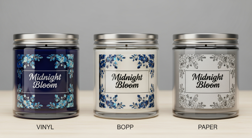
BOPP (Biaxially Oriented Polypropylene) offers an excellent middle ground for candle makers who need superior durability compared to paper but want to control costs more aggressively than premium vinyl allows. BOPP’s molecular structure provides impressive resistance to temperature variations and moisture, making it suitable for most candle applications while maintaining cost-effectiveness for larger production runs. The material accepts high-quality printing beautifully, allowing for vibrant colors and sharp text reproduction that rivals more expensive options.
BOPP’s white, clear, and chrome options open creative possibilities for different branding approaches. White BOPP provides excellent opacity for bold, colorful designs, while clear options work beautifully for minimalist branding where the focus should remain on the candle itself. Chrome BOPP creates premium metallic effects that suggest luxury without the cost of specialty metallic inks or foil stamping, making it popular for gift lines and seasonal collections.
For brands positioning themselves at the absolute premium end of the market, polyester film labels provide maximum durability and heat resistance that can withstand the most challenging conditions. While polyester represents a higher investment, the material’s exceptional stability and professional appearance justify the cost for luxury lines where every detail contributes to the overall brand perception. Polyester’s superior dimensional stability means labels maintain perfect registration and alignment even under stress, crucial for brands where precision and attention to detail are core brand values.
The adhesive system deserves as much consideration as the face material, as even the best substrates fail if the adhesive can’t maintain bond strength under challenging conditions. Permanent acrylic adhesives specifically formulated for challenging applications ensure labels stay attached despite temperature fluctuations and potential oil exposure. These advanced adhesive systems form chemical bonds with container surfaces that actually strengthen over time, ensuring your labels look as professional on the customer’s shelf as they did in your packaging facility.
Textured paper labels create authentic artisanal appeal that resonates strongly with customers seeking handcrafted, authentic experiences. However, choosing paper requires careful consideration of durability trade-offs. While paper labels can beautifully convey craftsmanship and environmental consciousness, they offer limited resistance to moisture and oils compared to synthetic alternatives. For brands where authenticity trumps absolute durability, high-quality paper labels treated with protective coatings can provide acceptable performance while maintaining the desired aesthetic.
Understanding that material choice directly impacts perceived quality helps inform strategic decisions about where to invest your labeling budget. Premium vinyl or polyester immediately signals quality and attention to detail, often allowing brands to command higher prices and attracting customers who associate superior packaging with superior products. Conversely, paper labels suggest handcrafted authenticity and environmental consciousness, appealing to customers who value traditional craftsmanship and sustainable practices.
The Complete guide to vinyl stickers provides deep technical insights into vinyl properties and applications, including detailed temperature resistance specifications that can help you make informed decisions based on your specific distribution and storage requirements. For larger production runs, vinyl sticker rolls offer cost-effective solutions that maintain professional quality while improving production efficiency.
The material foundation you establish sets the stage for everything else—the most brilliant design executed on inappropriate materials will fail, while thoughtful material selection provides a stable platform for design elements that communicate effectively with customers through strategic typography and layout choices.
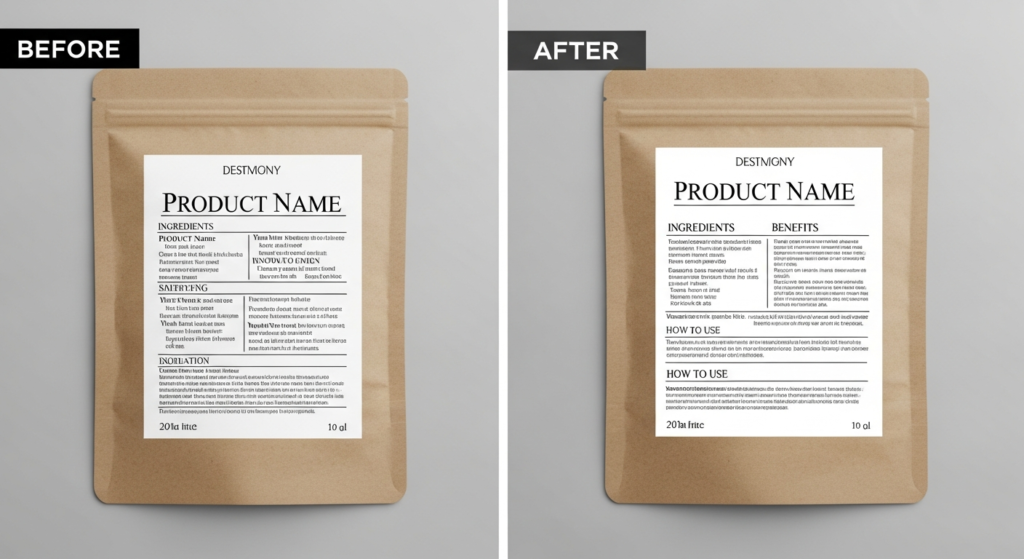
Transforming from a candle maker who creates functional labels to one who designs compelling visual communications requires understanding fundamental design principles that guide customer attention, communicate brand values, and influence purchasing decisions. Great label design isn’t about artistic talent—it’s about applying proven psychological and visual principles that make your products impossible to ignore while clearly communicating the information customers need to make confident purchasing decisions.
Typography hierarchy forms the foundation of effective communication, creating a visual roadmap that guides customer attention through your label information in the precise order you choose. Your brand name should dominate the visual hierarchy, typically requiring the largest, boldest typography that’s visible from the greatest distance. This isn’t about ego—it’s about recognition. Customers shopping for candles often browse quickly, and immediate brand recognition helps your loyal customers find your products while introducing your brand to new potential customers.
The scent or product name deserves secondary prominence in your typography hierarchy, as this information directly influences purchasing decisions. Customers shopping for specific scent families or seasonal fragrances need to quickly identify whether your product meets their needs. Effective scent naming goes beyond simple description—“Autumn Harvest” conveys more emotion and imagery than “Apple Cinnamon,” while “Coastal Breeze” suggests a more sophisticated experience than “Ocean Scent.”
Safety information and legal requirements deserve smaller but completely readable secondary text that doesn’t compete with primary marketing messages but remains accessible when customers need it. The key is achieving readability without visual dominance—customers need access to safety information, but prominent safety warnings shouldn’t be the first thing they notice about your product. Strategic placement and appropriate sizing ensure compliance while maintaining marketing effectiveness.
Sans-serif fonts like Arial, Helvetica, or modern alternatives ensure maximum readability across different label sizes and lighting conditions commonly found in retail environments. While decorative fonts might seem more creative or brand-appropriate, they often reduce readability, particularly at smaller sizes or under poor lighting conditions. Reserve decorative typography for accent elements or brand names where impact matters more than easy reading.
The psychology of color choices extends far beyond personal preferences, tapping into deep-seated associations that influence customer emotions and purchasing decisions. Warm tones including amber, deep burgundy, rich gold, and copper suggest comfort, relaxation, and luxury—perfect for candles marketed for stress relief, romantic evenings, or cozy home environments. These colors psychologically prime customers to expect warmth and comfort from your product, aligning expectations with the candle experience you’re creating.
Cool colors including crisp blues, fresh greens, and clean grays convey freshness, modernity, and sophistication, making them ideal for candles marketed for focus, energy, or contemporary home décor. Cool color palettes suggest efficiency and cleanliness, appealing to customers seeking products that enhance rather than overwhelm their living spaces.
Contrast ratios represent a technical consideration with profound practical implications for your label’s effectiveness. Maintaining a minimum 4.5:1 contrast ratio between text and background colors ensures readability across various retail lighting conditions, from bright fluorescent lights to dimly lit boutique stores. Poor contrast doesn’t just make labels hard to read—it suggests unprofessionalism and lack of attention to detail, qualities that undermine customer confidence in product quality.
Visual balance requires strategic use of white space (negative space) that allows important elements to breathe and prevents your label from appearing cluttered or overwhelming. White space isn’t wasted space—it’s a powerful design tool that increases readability, suggests premium quality, and guides attention to key information. Overcrowded labels suggest desperation or unprofessionalism, while thoughtful white space conveys confidence and sophistication.
Proper alignment creates order and professionalism that customers subconsciously associate with quality and attention to detail. Whether you choose centered, left-aligned, or right-aligned text, consistency across your label creates visual harmony that feels intentional and polished. Mixed alignment without clear reason creates chaos that undermines the professional impression you’re working to build.
Logical grouping of related information elements helps customers quickly process the information they need while reducing cognitive load. Related information should appear together—brand name with product name, safety information with usage instructions, contact information with website details. This grouping reduces the mental effort required to understand your label, creating a more positive customer experience.
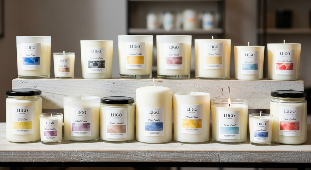
Brand consistency across product lines builds recognition and trust while creating economies of scale in your design and printing processes. Maintaining consistent color palettes, typography choices, and layout structures across your entire product range helps customers immediately recognize your products while reinforcing brand values and quality expectations. Consistency doesn’t mean identical—variations within consistent frameworks keep your line interesting while maintaining cohesive brand identity.
Information hierarchy should follow customer priorities and purchasing decision processes. The flow should logically progress: Brand/product name (immediate recognition) → key benefits (emotional connection) → weight/safety information (practical details) → decorative elements (aesthetic enhancement). This hierarchy matches how customers typically evaluate products, reducing friction in the decision-making process.
Understanding that effective design serves communication rather than decoration helps you make strategic choices that enhance rather than hinder your marketing objectives. Choosing the perfect sticker guide provides frameworks for making design decisions that balance aesthetic appeal with practical functionality, ensuring your creative choices support rather than undermine business goals.
For brands seeking premium positioning, clear stickers with white ink create sophisticated “no-label” looks that maintain readability while allowing the product itself to remain the visual focus. This approach works particularly well for minimalist brands or products where the candle color and container design are key selling features.
Effective design principles provide the framework, but success depends on proper technical implementation that ensures your carefully planned designs apply correctly and maintain their professional appearance throughout the entire product lifecycle.
The bridge between brilliant design concepts and professional execution lies in mastering the technical specifications that ensure your labels apply flawlessly, maintain their appearance, and enhance rather than detract from your overall product presentation. Getting these details right separates amateur-looking products from professional brands that command premium prices and customer loyalty.
Standard candle jar sizing follows industry conventions that have evolved to optimize both aesthetics and functionality. Small candles typically use containers ranging from 2-3 inches in diameter, making 2” x 3” labels ideal for providing essential information without overwhelming the container’s proportions. These smaller labels work perfectly for votive candles, travel-sized products, or gift sets where multiple items need to fit attractively in packaging.
Medium candles in 3-4 inch containers benefit from 3” x 4” labels that provide sufficient space for brand name, scent description, and essential safety information while maintaining visual balance. This size category represents the sweet spot for many candle makers, offering enough surface area for compelling design while remaining cost-effective for various production volumes.
Large candles in containers 4+ inches in diameter can accommodate 4” x 6” labels that provide space for more extensive branding, detailed scent descriptions, usage instructions, and even brand storytelling elements. These larger labels justify higher price points while providing customers with the comprehensive information they expect from premium products.
Custom sizing options allow brands to perfectly match their labels to unique packaging choices, creating distinctive shelf presence that helps products stand out in crowded retail environments. However, custom sizing often involves higher costs and longer lead times, making careful planning essential for maintaining production schedules and budget targets.
Round labels provide optimal coverage and visual balance for cylindrical containers, following the natural contours of traditional candle jars while maximizing usable design space. The curved application requires more careful technique but creates seamless integration between label and container that suggests premium attention to detail.
Rectangular labels work beautifully for square or hexagonal jars, providing clean lines and formal presentation that appeals to customers preferring contemporary, geometric aesthetics. The straight edges of rectangular labels on angular containers create intentional design harmony that suggests careful consideration of every detail.
Finish selection dramatically impacts both aesthetic appeal and functional performance, making this choice crucial for achieving your brand positioning goals. Gloss finishes enhance color vibrancy by reflecting light back through the inks, making photographs appear more vivid and graphics more engaging. The enhanced color saturation possible with gloss finishes helps products command attention in competitive retail environments where dozens of similar products compete for customer attention.
Gloss finishes also provide practical advantages through easy cleaning and superior resistance to fingerprints and minor scuffs that can accumulate during handling and shipping. For products likely to be handled frequently or displayed in high-traffic areas, gloss finishes maintain their professional appearance longer than alternatives.
Matte finishes create sophisticated elegance while reducing glare under various lighting conditions, particularly important in retail environments with bright fluorescent or LED lighting that can make glossy surfaces difficult to read. The soft, non-reflective surface of matte finishes suggests luxury and sophistication, appealing to customers who associate understated elegance with quality.
Matte finishes also provide superior writability if you need to add handwritten elements like batch numbers or personal messages, making them popular for artisanal brands that want to maintain personal touches in their presentation.
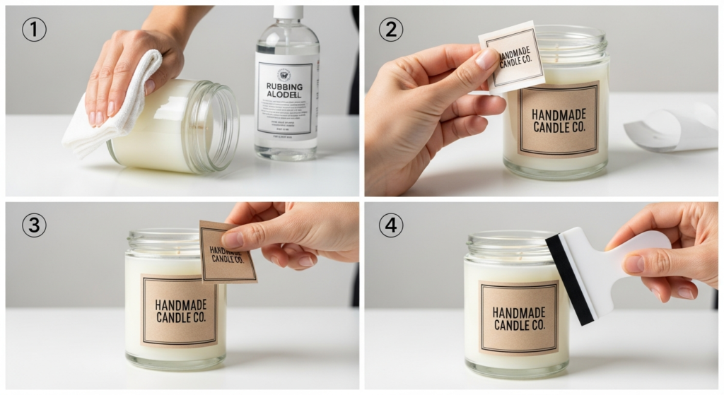
Surface preparation represents the foundation of professional label application, yet many candle makers underestimate its importance until they experience adhesion failures. Cleaning with isopropyl alcohol removes manufacturing oils, fingerprints, and other contaminants that prevent proper adhesive bonding. This simple step prevents 90% of application problems while requiring minimal time and cost.
Room temperature application ensures optimal adhesive flow and bonding, as cold surfaces prevent proper adhesive activation while hot surfaces can cause premature bonding before proper positioning. Plan application sessions during moderate temperature conditions, and allow containers to reach room temperature if they’ve been stored in hot or cold environments.
Professional application techniques determine whether your carefully designed labels enhance or detract from your overall product presentation. Starting from one edge rather than attempting to center-apply entire labels prevents stretching and ensures proper registration. Smooth gradually using consistent pressure to eliminate air bubbles while maintaining proper label position—rushed application often results in crooked labels or trapped air that creates unprofessional appearance.
Consistent pressure across the entire label surface activates the adhesive system and ensures long-term bonding. Many application problems result from inadequate pressure during initial application, allowing environmental factors to gradually compromise adhesion over time.
Storage considerations affect both label performance and application efficiency, making proper inventory management crucial for consistent results. Moderate temperature and humidity levels preserve adhesive properties and prevent backing papers from absorbing moisture that can complicate removal during application. Paper sticker rolls offer cost-effective solutions for high-volume production while maintaining consistent quality when stored properly.
For challenging applications or premium permanent bonding requirements, high tack stickers provide enhanced adhesion that withstands demanding conditions while maintaining removability if repositioning becomes necessary during application.
Quantity planning should account for 5-10% extra labels beyond your immediate production needs to cover application errors, quality control rejections, and future reprints. This planning prevents production delays when single labels fail during application while ensuring batch consistency for products that may be produced over extended periods.
Understanding these technical requirements creates the foundation for avoiding common pitfalls that can undermine even the most carefully planned labeling strategies, leading us to examine the critical mistakes that cost candle makers money and damage brand reputation.
Even experienced candle makers often fall victim to labeling mistakes that could be easily prevented with proper knowledge and planning. These errors don’t just create immediate problems—they can damage brand reputation, waste inventory, and create costly compliance issues that undermine business growth. Understanding and avoiding these common pitfalls protects your investment while positioning your brand for professional success.
Inadequate heat testing represents perhaps the most costly mistake new candle makers make, often discovered only after investing in large label quantities or, worse, after products reach customers. Candle labels face unique thermal challenges that standard product testing doesn’t reveal. During shipping, products may sit in vehicles where temperatures exceed 70°C, while sudden temperature changes during air transport can cause rapid expansion and contraction cycles that stress adhesive bonds.
The solution requires comprehensive testing that simulates real-world conditions rather than ideal laboratory environments. Test your chosen labels on actual candles during complete burn cycles that include lighting, burning for recommended durations, extinguishing, cooling, and relighting. This cycle stresses labels through the full range of temperature and humidity variations your customers will experience, revealing potential problems before they become expensive failures.
Temperature testing should extend beyond normal use to include shipping and storage extremes. Place labeled candles in hot vehicles during summer weather, cold garages during winter, and humid environments like bathrooms to ensure labels maintain their integrity across the full range of conditions your products will encounter throughout their lifecycle.
Poor adhesive selection creates problems that often don’t appear until weeks or months after application, making this mistake particularly frustrating and expensive. Standard adhesives designed for paper applications or mild conditions simply cannot handle the oil exposure, temperature variations, and container materials common in candle applications. When labels begin peeling or shifting on customer shelves, the damage to your brand reputation far exceeds the cost savings from cheaper adhesive systems.
The solution involves matching adhesive strength and formulation to your specific application requirements rather than choosing based solely on cost considerations. Permanent acrylic adhesives specifically formulated for challenging applications provide superior bonding to the glass and metal containers commonly used for candles while maintaining integrity when exposed to essential oils and temperature fluctuations.
Consider the container surface texture when selecting adhesives—smooth glass requires different adhesive properties than textured ceramic or metal containers. Test adhesive performance on your exact container materials rather than assuming similar surfaces will perform identically.
Insufficient contrast between text and background colors creates readability problems that become obvious only under challenging lighting conditions commonly found in retail environments. What looks perfectly readable under your design studio lighting may become illegible under fluorescent store lights, dim boutique ambiance, or the varying light quality customers experience in their homes.
The solution requires testing your designs under various lighting conditions before finalizing color choices. Print sample labels and evaluate them under fluorescent lights, incandescent bulbs, LED lighting, and natural daylight to ensure consistent readability. Pay particular attention to how metallic inks and dark backgrounds perform under different light sources, as these choices often create problems that aren’t apparent under single lighting conditions.
Color blindness affects approximately 8% of men and 0.5% of women, making color-dependent information inaccessible to a significant portion of your potential customer base. Ensure that critical information remains distinguishable through contrast and typography rather than relying solely on color differences.
Overcrowded design represents one of the most common mistakes that well-intentioned candle makers make when trying to include every possible piece of information on their labels. The result overwhelms customers and reduces the impact of truly important information while creating an amateur appearance that undermines brand credibility.
Effective labels follow the “less is more” principle, prioritizing essential information while using strategic white space to create visual breathing room. Begin by identifying the three most important pieces of information your customers need—typically brand name, scent/product name, and key safety information—and build your design hierarchy around these priorities.
Secondary information including detailed usage instructions, company contact information, and extensive ingredient lists can be communicated through other channels including hang tags, packaging inserts, or QR codes that link to comprehensive online information. This approach keeps labels clean and impactful while ensuring customers can access detailed information when needed.
Inconsistent branding across product lines confuses customers and dilutes brand recognition, making it difficult for loyal customers to identify your products while preventing new customers from understanding your brand identity. This mistake often develops gradually as product lines expand without proper brand guidelines to maintain consistency.
Develop and document comprehensive style guidelines that specify color palettes, typography choices, layout structures, and design elements that should remain consistent across all products. These guidelines ensure that seasonal products, new scent launches, and special editions maintain brand continuity while allowing creative variations that keep your line interesting and fresh.
Consistency extends beyond visual elements to include terminology, tone of voice, and information organization. Use the same language for similar concepts across all products—if you describe one candle as “hand-poured,” ensure similar products use consistent terminology rather than mixing “artisan-crafted” and “handmade” descriptions that suggest different quality levels.
Ignoring scale during design development leads to text that’s too small for older customers or important safety information that appears less prominent than decorative elements. Design at actual size rather than relying on screen representations that don’t accurately reflect how labels will appear on finished products.
Consider your target demographic when making sizing decisions—candles often appeal to older customers who appreciate larger text sizes for comfortable reading. Safety information should never be so small that it discourages reading, as clear communication protects both customers and your business from liability issues.
Missing safety information creates both liability risks and unprofessional appearance that suggests inexperience or carelessness. Even when comprehensive safety information isn’t legally required, including essential guidance demonstrates professional responsibility and customer care that builds trust and confidence in your brand.
Essential safety information includes wick trimming guidance, maximum burn time recommendations, heat-resistant surface requirements, and basic fire safety reminders. This information protects customers while demonstrating that your brand prioritizes safety and customer satisfaction over mere compliance.
For products requiring special handling or having specific contraindications, clear warnings prevent misuse while protecting your business from liability claims. Removable stickers provide solutions for temporary labeling needs or seasonal product variations that require different safety information.
Static cling options offer reusable labeling alternatives for gift sets or refillable containers where permanent labeling might interfere with the customer experience while maintaining professional appearance and essential information communication.
By systematically avoiding these common pitfalls and implementing the comprehensive strategies outlined throughout this guide, you position your candle business to create professional labeling that enhances rather than undermines your marketing efforts while building the customer trust and brand recognition essential for long-term success.
Creating exceptional candle labels requires successfully balancing the complex intersection of compliance requirements, materials science, design principles, and practical application techniques—a challenge that separates professional brands from amateur attempts. Throughout this comprehensive guide, you’ve discovered how Australian candle makers can navigate regulatory landscapes while creating labels that transcend mere compliance to become powerful marketing tools that enhance brand storytelling and drive measurable customer engagement.
The investment in quality labeling creates measurable returns through increased perceived value, improved brand recognition, and reduced compliance risks that protect your business from costly mistakes. Whether you’re applying these principles to your first batch of artisanal candles or refining labels for an established product line, the techniques covered here provide the foundation for elevating your packaging from merely functional to genuinely phenomenal.
Professional labeling strategy requires understanding that every design decision represents an investment in your business’s future success. Your choice of heat-resistant vinyl over cheaper paper materials demonstrates quality consciousness that customers recognize and value. Your commitment to proper contrast ratios and readable typography shows respect for customer needs that builds loyalty and trust. Your attention to consistent branding across product lines creates recognition advantages that compound over time, making each new product launch more successful than the last.
The technical aspects of successful label application—from proper surface preparation to strategic material selection—protect your design investment while ensuring that labels maintain their professional appearance throughout the demanding lifecycle of retail distribution. Understanding these technical requirements prevents the costly mistakes that can undermine even the most brilliant creative strategies, while proper planning ensures consistent results that support rather than hinder your business growth.
Remember that label design represents an iterative process where continuous improvement drives long-term success. Test different approaches systematically, gather authentic customer feedback through surveys and sales data analysis, and continuously refine your strategy based on real-world performance rather than assumptions. The most successful candle brands treat labeling as an ongoing investment in brand development rather than a one-time design decision.
Your labels function as silent salespeople working 24/7 to represent your brand values, quality standards, and customer commitment—making every design decision a strategic investment in customer relationships that drive sustainable business growth. The comprehensive approach outlined in this guide ensures that your labeling strategy supports rather than undermines your broader business objectives while positioning your products for success in Australia’s increasingly competitive candle market.
Professional-quality labels represent the difference between products that struggle for attention and brands that command premium prices and customer loyalty. Fast Stickers specializes in heat-resistant, oil-resistant materials specifically engineered for candle applications, backed by 15+ years of Australian printing expertise and industry-leading turnaround times that support your production schedules.
Whether you’re launching your first product line or scaling an existing business, our Australian-made quality ensures your labels maintain their professional appearance throughout challenging shipping conditions and diverse retail environments. Browse our vinyl sticker options for premium durability that withstands temperature fluctuations and oil exposure, or request a custom quote for your specific candle labeling requirements.
Explore our complete sticker range for comprehensive packaging solutions that support your brand’s growth while maintaining the consistency and quality that builds customer trust. Contact us today to discuss your candle label project and discover why leading Australian brands trust Fast Stickers for their most important packaging needs—with free express shipping nationwide and personalized service that ensures your labeling strategy supports your business objectives.
Australian-made excellence, delivered with the speed and reliability your business demands.
QR Code Stickers Australia: Smart Solutions for Business Growth In just three short years, Australia has witnessed a digital revolution that transformed how businesses interact

The Aussie Choice for a Greener Tomorrow Eco-friendly stickers are no longer a niche choice—they’re quickly becoming the go-to for Aussie businesses and event organisers

Choosing the Perfect Sticker Type for Your Project: A Quick Guide Picking the right sticker can make or break your project. Many get stuck choosing

Harnessing Gippsland’s Printing Expertise for Australian Business Success Most Australian businesses settle for slow, generic printing from big companies. You don’t have to. Gippsland printing
Picture this: you’ve invested months developing the perfect food product, secured distribution partners, and launched with enthusiasm—only to face a devastating product recall because your