
Best School Labels in Australia
Best School Labels in Australia (2026): A Parent’s Complete Buying Guide Picture this: it’s the Sunday night before the first day of school. The
Picture this: a small business owner in regional Victoria has spent weeks refining her brand. She’s chosen the colours carefully, tweaked the logo a dozen times, and finally felt that deep satisfaction of this is it when she looked at the design on her screen. She uploads the file, places the order for her custom stickers, and waits excitedly for the delivery that will go on every product she ships.
The package arrives. She peels one open — and her heart drops.
The colours are muddy. The edges are soft. The black background looks like washed-out charcoal. It barely resembles what she designed. And now she has 500 of them.
This scenario plays out more often than it should across Australia, and the frustrating truth is that it almost never has to happen. The vast majority of print quality problems with custom stickers come down to a single root cause: artwork that wasn’t prepared for print. Not a bad printer, not cheap materials — just a file that was built for a screen, not for ink on a substrate.
This guide exists to make sure that never happens to you. Whether you’re a business owner uploading your logo for the first time, a designer preparing files for a client, or an individual ordering personalised stickers for an event — by the time you finish reading, you’ll understand everything that separates a professional, print-ready file from one that produces disappointing results.
Here’s what we’ll cover:
This guide draws on over 15 years of Australian sticker printing experience from the team at Fast Stickers, including a complimentary artwork review and design service that catches file problems before they ever reach the press. Whether you’re doing it yourself or leaning on the team for support, understanding these fundamentals will make every order faster, smoother, and better.
Let’s start at the very foundation — why resolution is the single most critical technical setting you’ll make before placing your order.
There’s a common misconception among first-time sticker buyers: that the printer does the heavy lifting, and the artwork is just a starting point. Send the file, they’ll sort it out. After all, these are professional printing machines — surely they can handle a PNG downloaded from Canva?
The reality is almost the opposite. The print process is unforgiving in a way that digital screens are not. When you view a design on a monitor, your screen is actively compensating for lower-quality images — blending pixels, backlit display technology, and the viewing distance all conspire to make things look better than they are. The moment that same file is sent to a printer, every imperfection is rendered at full physical size in ink on material. There is nowhere to hide.
The journey from your design file to a finished sticker involves several critical stages: the artwork is prepared and reviewed in pre-press, converted to the printer’s output format, and then physically produced — either through digital or plate-based printing. At each stage, errors don’t disappear; they compound. A slightly wrong colour mode at the artwork stage becomes a noticeably wrong colour at print. A resolution that looks fine on screen becomes visibly pixelated at 100mm wide on vinyl.
This is particularly relevant for Australian businesses that rely on accessible tools like Canva, Microsoft Word, or simply screenshot exports of their existing social media graphics. These tools produce files that are optimised for screens — typically in RGB colour mode at 72 DPI. Both of those settings, as we’ll explore in detail, are fundamentally incompatible with professional print production.
The concept you want to internalise is print-ready artwork — a file that arrives at the printer requiring zero rework. It’s set to the correct resolution. It’s in the right colour mode. It uses the right file format. It has bleed and safe zones set up correctly. And critically, it contains no hidden technical problems — no unembedded fonts, no linked images that the printer can’t access, no overprint settings that will cause unexpected results.
Getting to print-ready isn’t complicated once you understand the rules. And for those who would rather focus on the design and leave the technical setup to someone else, Fast Stickers’ free artwork and design service exists precisely for that purpose — their experienced team prepares files correctly before anything goes to press, so the result always matches the intention.
But understanding why these rules exist makes you a smarter buyer, a more capable designer, and someone who can troubleshoot quickly when something looks off. The Fast Stickers FAQ outlines accepted file formats — AI, EPS, PDF, PNG, and JPG — and understanding what those formats actually mean for your print result is where we’ll go next.
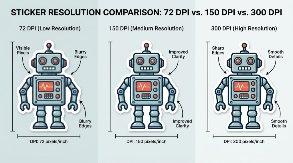
The most common culprit behind blurry, pixelated stickers? Resolution. Here’s exactly what DPI means for your print files — and the number you must never go below.
DPI stands for dots per inch — the number of individual ink dots a printer places within every inch of the final output. More dots per inch means more detail, finer edges, and sharper text. Fewer dots means the opposite: coarser output, visible grain, and edges that blur when you look closely.
Understanding DPI starts with understanding why the number matters at the size you’re printing. A file’s DPI rating is always relative to its physical dimensions — and this relationship is where most people go wrong.
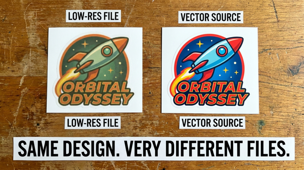
The web problem: Images downloaded from websites, exported from social media platforms, or taken as screenshots are almost universally at 72 DPI. This is the standard resolution for screens, and it’s perfectly fine for digital display. But at 72 DPI, a 10cm × 10cm sticker would contain roughly one-fifth of the detail that same image would carry at 300 DPI. The result is a print that looks like it was designed in the early days of inkjet printing — soft, blurry, and unprofessional.
The rule you need to remember: All raster images in your sticker artwork must be at least 300 DPI at the actual final print size. Not at a thumbnail size. Not “zoomed out.” At the real dimensions of the sticker you’re ordering.
One of the most persistent myths in design is that you can fix a low-resolution image by scaling it up in your design software. You cannot. When software enlarges a low-res image, it uses a process called interpolation — essentially guessing what the missing pixels should look like based on the surrounding ones. The result is a slightly larger image that is equally blurry, or often blurrier. Resolution is either in the file from the start, or it isn’t. There is no “upscaling” shortcut.
The relationship between physical size and DPI is worth understanding clearly. Imagine a raster image that’s 10cm wide at 300 DPI. If you scale that image up to 20cm wide in your layout, you’ve effectively halved the DPI — you now have a 150 DPI image at that size. For large-format prints viewed from a distance, 150 DPI may be acceptable. For custom stickers that people pick up, apply, and view at arm’s length or closer, 300 DPI is the minimum and should be considered non-negotiable.
The practical implication of this: always set up your document at the correct final size and 300 DPI from the very beginning. Don’t design at a small size and scale up later. Don’t design at 72 DPI and change the resolution setting in export — changing the DPI number in your export settings without having actual pixel data to support it changes nothing in terms of real print quality.
This is also why die-cut stickers — where the cut line follows the exact contour of the design — require particularly sharp, high-resolution artwork. When the cutting path follows the edge of an element in your design, any softness or pixelation in that edge translates directly to an imprecise cut. The higher your resolution, the cleaner and more precise the final shape.
The good news is that there’s a category of files that sidestep the DPI issue entirely — and understanding them might be the single best upgrade you can make to your sticker file workflow. More on that in Section 4. But first, there’s another setting that trips up even experienced designers: the difference between the colour your screen shows and the colour your printer can produce.
Colour is not a single universal language. The way your monitor creates colour and the way a printing press creates colour are fundamentally different processes — and when those two worlds collide without proper translation, the result is a sticker that looks noticeably different from what you designed.
The screen you’re reading this on uses the RGB colour model — Red, Green, and Blue light in different combinations create every colour you see. This is an additive colour system: combine all three at full intensity and you get white. RGB has a wide, vibrant gamut, capable of producing luminous blues, electric greens, and colours so saturated they almost seem to glow. It’s a beautiful system — for screens.
CMYK — Cyan, Magenta, Yellow, and Key (Black) — is the colour model of physical printing. Where RGB adds light, CMYK layers ink. It’s a subtractive system: the inks absorb light rather than emit it, and mixing all colours together produces (in theory) black. The critical difference is that the CMYK gamut is significantly smaller than RGB. There are colours that exist in RGB — vivid neon tones, certain electric blues, and some saturated greens — that simply have no direct CMYK equivalent. They can only be approximated.
Think of it this way: RGB is painting with light, and CMYK is painting with physical ink. Light can do things that ink cannot.
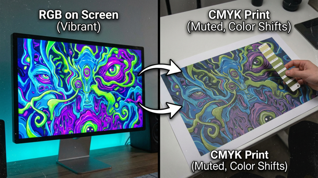
When you submit a file in RGB colour mode to a printer, the printer’s software (called a RIP — Raster Image Processor) automatically converts the RGB values to CMYK. This sounds convenient, but the automatic conversion is often imperfect and rarely matches what your screen showed you. The conversion algorithm makes mathematical decisions about how to approximate RGB colours within the CMYK gamut — and those decisions don’t always align with your creative intent.
The result can be subtle (a slightly cooler blue, a less vivid orange) or dramatic (a bright neon green becoming a muted sage, a vibrant purple turning muddy). Either way, you didn’t approve the conversion — and you may not see it until your stickers arrive.
The rule: Always convert your artwork to CMYK before submitting to your printer. Do not rely on automatic conversion.
In Adobe Illustrator, the conversion is straightforward: go to Edit → Document Colour Mode → CMYK. In Photoshop, go to Image → Mode → CMYK Colour. In both cases, check all elements after conversion — you may need to manually adjust colours that shifted significantly.
For Canva users, the options are more limited. Canva operates in RGB and offers a “PDF – Print” export option which is the best available choice for print submission. However, for designs where colour accuracy is critical — especially for branded stickers with precise colour requirements — it’s worth considering a professional design tool or sending your concept to Fast Stickers’ design team who can prepare the file in CMYK from the start.
A note for businesses with established brand colour guidelines: always provide your brand’s CMYK colour breakdown, not just hex codes. Hex codes are RGB values — they define colours for screens, not for ink. If your brand guidelines only list hex codes, work with a designer or your printer to establish the CMYK equivalents and save them as part of your brand assets. This is particularly relevant for custom vinyl stickers, where colour vibrancy and brand consistency on physical products matter enormously.
If your brand uses Pantone colours, be aware that Pantone spot colours are not directly printable via standard CMYK process printing — they must be converted to their CMYK approximation. Some degree of colour variance between Pantone and CMYK output is inherent, and your printer should be able to advise on expected results. For custom stickers used in small business branding, establishing accurate CMYK values from the start eliminates guesswork across every printed asset, from stickers to labels to packaging.
Once you’ve nailed colour mode, the next decision is arguably the most important of all for long-term quality: choosing between vector and raster file formats. This choice determines whether your sticker design stays sharp at any size — or falls apart the moment it’s scaled.
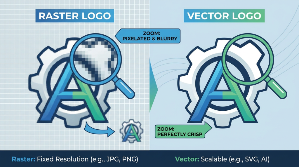
Every design file you’ve ever worked with falls into one of two fundamental categories: raster or vector. Understanding the difference isn’t just a technical detail — it’s the single decision that most directly determines the ceiling of your print quality.
Raster files are constructed from a fixed grid of pixels. Every JPEG, PNG, GIF, and BMP is a raster file. The resolution is baked in at the moment of creation — if you create a 10cm × 10cm PNG at 300 DPI, that’s what you have. Scale it up and the quality degrades, because you’re simply stretching existing pixels. Raster files are the natural format for photography and complex, texture-rich illustrations.
Vector files work on an entirely different principle. Instead of pixels, they store mathematical descriptions of shapes, paths, and curves. An Illustrator AI file doesn’t store “this pixel is blue” — it stores “there is a circle of this diameter, with this colour fill, at these coordinates.” Because the shapes are defined mathematically, they can be rendered at any size — from a 2cm sticker to a 2-metre banner — with absolutely no loss of quality.
For custom sticker printing, vector files are the gold standard — and for good reason:
Common vector formats include: AI (Adobe Illustrator’s native format), EPS (Encapsulated PostScript — widely compatible across print systems), SVG (Scalable Vector Graphics — increasingly common for web and print), and PDF (which can contain either vector or raster content, or both).
This doesn’t mean raster files are always wrong. Photography is inherently raster, and many sticker designs incorporate photographic elements beautifully. The key is the hybrid approach: vector elements for logos, text, shapes, and cut paths — with high-resolution raster images (300 DPI minimum) embedded for any photographic content. This combination gives you the best of both worlds and is the approach professional designers use as a matter of course.
One detail that catches even experienced designers off-guard: fonts in vector files. When you have live, editable text in a file like an AI or EPS document, the printer’s system needs that exact font installed on their machine to render it correctly. If they don’t have it, a substitution font is used — and the result can range from subtly wrong to completely broken. The solution is simple: before finalising your file, select all text and convert it to outlines (in Illustrator: Select All → Type → Create Outlines). This converts each character into a vector path, permanently embedding its shape in the file and eliminating any font dependency.
Keep an editable backup copy before outlining — once text is converted to paths, it can no longer be edited as text.
For quick reference, here’s how file formats rank for sticker printing submissions:
If you’re unsure whether your file is truly vector, a quick test: open it in Adobe Illustrator and zoom to 3,200% magnification. If every edge remains razor-sharp at that zoom level, it’s a true vector file. If you see pixels or softening, it’s raster. The Fast Stickers FAQ confirms that vector formats are preferred — particularly for die-cutting, where the precision of the cut path depends entirely on the sharpness of the vector outline.
This is especially critical for clear stickers with white ink, where the design is printed on transparent material and any imprecision in edges is immediately visible against the surface beneath. For anyone comparing clear vs white sticker options, understanding file format requirements is a key part of choosing the right product for your design style.
With the right file format and resolution sorted, there’s one more set of technical settings that catches even experienced designers off-guard: bleed, safe zones, and — for die-cut stickers — the cut path itself. Getting these wrong is one of the most common reasons stickers come back with white edges or cropped text.
You’ve set up your file at 300 DPI. You’ve converted to CMYK. You’ve outlined your fonts and embedded your images. The design looks exactly right. And then your stickers arrive with a thin white border on one edge that wasn’t in the design, or with a sliver of your background colour missing, or — worst of all — with the edge of your logo or a letter of text clipped off.
These aren’t printer errors. They’re document setup errors. And they’re entirely preventable.
Understanding Bleed
A bleed is an extension of your artwork beyond the intended final edge of the sticker. It exists because cutting machines — even sophisticated ones — operate with a small mechanical tolerance. Over the course of a production run, the cutting position can vary by fractions of a millimetre. Without bleed, even a 0.5mm variation can leave a thin sliver of unprinted white material visible at the sticker’s edge, because the background colour stopped exactly at the trim line and the cut landed fractionally outside it.
The solution is to extend any background colours, textures, or design elements that reach the sticker’s edge beyond that edge — into the bleed area. This way, regardless of minor cutting variation, the colour extends continuously to the cut point without any white showing through.
Standard bleed for sticker printing: 3mm on all sides.
This means if your sticker design is 100mm × 100mm, your artwork canvas should be 106mm × 106mm — the extra 3mm on each side is the bleed zone. Every background element must extend fully into this zone. Do not stop backgrounds, patterns, or edge-reaching elements at the trim line.
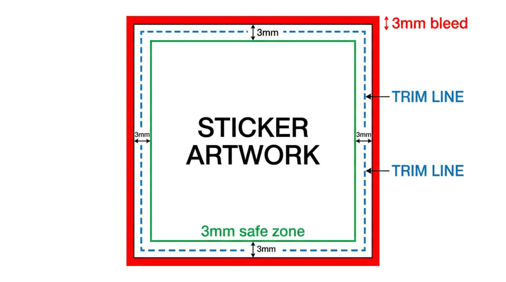
Understanding the Safe Zone
The safe zone is the inverse of bleed — it’s an inner boundary inside the trim line, within which all critical content must sit. Just as cutting can miss the trim line slightly outward (solved by bleed), it can also miss slightly inward — which means content placed too close to the edge risks being cropped.
Standard safe zone: 3mm inside the trim line.
Text, logos, faces, contact details, QR codes — any content that must not be cropped should sit within this inner boundary. If your sticker is 100mm × 100mm, your safe zone inner boundary sits at 94mm × 94mm from the sticker’s visual centre.
To summarise the three-zone document structure:
Die-Cut Stickers and Cut Paths
Standard stickers — squares, rectangles, circles — use a simple trim line. But custom die-cut stickers with shapes that follow the contour of your design require an additional element: the cut path (also called a die line).
A cut path is a vector path on its own dedicated layer that tells the cutting machine exactly where to cut. It should be created as a path with no fill and no visible stroke in the final print, typically set as a spot colour named CutContour in Adobe Illustrator — this is the naming convention that most professional print production systems recognise. The cut path should closely follow the outline of your design (with a small offset if needed for handling), and it must never overlap live artwork elements.
Canva has a built-in bleed option in its PDF – Print export — always enable it. However, Canva cannot create die-cut paths, so for custom-shaped stickers, a professional design tool or assistance from Fast Stickers’ team is required.
The same bleed and safe zone principles apply to vinyl sticker rolls used for product labels — the mechanical tolerances of high-volume roll cutting make proper bleed and safe zone setup just as important at scale as for individual stickers.
“Not sure if your file is set up correctly? Our team reviews every file before it goes to print — get a quote and upload your artwork for a free check.“
With your document structure correctly established, there are a few advanced artwork settings that separate good sticker prints from truly exceptional ones — starting with one that almost no one outside the printing industry thinks about: rich black.
You’ve nailed the fundamentals. Your resolution is at 300 DPI, your colours are in CMYK, your file is a vector PDF with outlined fonts and embedded images, and your bleed is set up correctly. At this point, most designers would call it done.
But there’s a final tier of print preparation knowledge that separates competent artwork from truly professional output — the details that experienced pre-press technicians check as a matter of course, and that make a visible difference in the finished sticker.
The Rich Black Problem (and Solution)
Here’s something that surprises most designers the first time they encounter it: printing at K:100 — pure 100% black ink — does not produce a visually satisfying black in large areas. Instead, it often prints as a flat, slightly cool, somewhat grey-looking tone that lacks the visual weight and density that a “true black” background or headline demands.
This happens because a single ink channel, even at full saturation, doesn’t produce the ink density that multiple layers of overlapping inks achieve. To get a genuinely deep, rich black in large printed areas, you need what the industry calls rich black — a CMYK formula that layers multiple inks to produce a denser, more saturated result.
The widely used industry-standard formula, recommended by printing specialists including Primoprint, is:
C: 60 M: 40 Y: 40 K: 100This combination of inks creates a deep, dense, visually compelling black that makes backgrounds sing and headlines command attention.
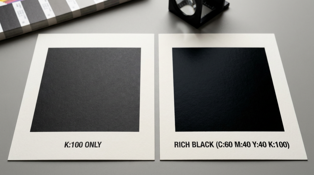
When to use rich black: large black backgrounds, wide black borders, oversized black headlines, and any black element that covers a significant area.
When NOT to use rich black: small body text, fine print, or any text under approximately 14pt. At small sizes, the slight mechanical variance between ink layers in a CMYK press (called misregistration) can cause the multiple ink channels to sit fractionally out of alignment — resulting in blurry, soft-edged text rather than crisp letterforms. For any text that needs to remain sharp and readable at small sizes, use K:100 only.
The total ink coverage for the rich black formula (C:60 + M:40 + Y:40 + K:100 = 240%) sits well within the safe range for most sticker substrates, which typically have a maximum total area coverage (TAC) of around 300–320%.
Outlined and Converted Fonts
This was touched on in the vector section, but it deserves its own emphasis here because font substitution errors are one of the most common — and most jarring — surprises designers encounter in print production.
When you submit a file with live, editable text, the printer’s pre-press system needs that exact font to be installed on their machine. If it isn’t — and for less common or purchased typefaces, this is entirely plausible — the system substitutes a default or similar font. The layout shifts. The spacing changes. Characters may reflow. The result can range from a slightly different look to a completely broken design.
The fix: In Adobe Illustrator, select everything and go to Type → Create Outlines before saving your final print file. In Adobe InDesign, export to PDF with fonts embedded. Either approach permanently locks the visual shape of your text into the file, regardless of what fonts are installed at the printer’s end. Always keep an editable backup before outlining.
Embedded vs Linked Images
Design software like Adobe Illustrator can reference external image files in two ways — linked (the file on your hard drive is referenced but not included) or embedded (the image data is stored inside the document). When you submit a file with linked images, the printer’s system cannot access those external files — they exist only on your computer. The result is grey boxes where your images should be.
The fix: Before submitting, go to Window → Links in Illustrator, select all listed images, and choose Embed Image(s). The file size will increase, but the images will be permanently included in the document.
Transparency and Overprint
Two more settings that can cause unexpected results in print:
Transparency effects — soft light blending, multiply modes, and other screen-based transparency effects don’t always translate cleanly to CMYK print. If your design uses these effects, flatten transparency before submission (Object → Flatten Transparency in Illustrator) to ensure what you see is what prints.
Overprint settings — objects with “Overprint Fill” enabled allow the inks of underlying objects to show through rather than being knocked out. This is occasionally intentional but almost never what a designer means when it happens accidentally. Check the Attributes panel in Illustrator and ensure overprint settings match your intent.
The Fast Stickers team in Gippsland reviews every file before it reaches the press, catching issues like these before they become your problem. For designs where every detail matters — like custom candle labels where text precision and colour accuracy are critical to product presentation — this pre-press review step is the difference between a perfect result and an expensive reprint.
Even with all these technical settings in place, there’s a final category of artwork problems that consistently trips up orders — the avoidable mistakes. Here’s the definitive list of what goes wrong, and exactly how to fix it before you hit submit.
Every print quality problem has a cause — and almost all of them are preventable. This section is your practical checklist: the eight mistakes that account for the vast majority of disappointing sticker orders across Australia, and the exact fix for each one.
Use this list every time you prepare a file. Bookmark it. Screenshot it. It will save you time, money, and the specific frustration of opening a delivery that should have been a celebration.
1. Submitting low-resolution images (below 300 DPI)
The single most common error. Low-resolution images look fine on screen but print as blurry, pixelated, or grainy. The fix: always confirm your raster images are at 300 DPI at the actual final print size. Not at thumbnail size, not at a different dimension — at the exact size of the sticker you’re ordering. If you don’t have the original high-resolution source file, you may need to recreate the design element or have a designer recreate it in vector.
2. Submitting artwork in RGB colour mode instead of CMYK
When a printer’s system converts your RGB file automatically, the result can be significantly different from what you designed — particularly for vivid blues, bright greens, and saturated purples. The fix: convert to CMYK manually in your design software before exporting. Check each colour after conversion and adjust if needed. Never submit an RGB file and assume the conversion will match your screen.
3. No bleed or insufficient bleed
Without a 3mm bleed on all sides, even minor cutting variance leaves a white edge where background colour should extend to the sticker’s edge. This is especially noticeable on designs with solid colour backgrounds or edge-to-edge patterns. The fix: set up your document with 3mm bleed from the start, and extend all background elements fully into the bleed zone.
4. Critical content placed inside the safe zone boundary
Text, logos, QR codes, and other important elements placed too close to the trim edge can be partially or fully cropped during cutting. This is especially problematic for designs with contact information or product details near the edge. The fix: keep all critical content at least 3mm inside the trim line. When in doubt, move it further in.
5. Fonts not outlined or converted to paths
Unoutlined fonts in a submitted file require the printer to have that exact font installed — which they often won’t. The result is font substitution, layout reflow, and a design that doesn’t match what you built. The fix: convert all text to outlines in Illustrator (Type → Create Outlines) or export to a properly embedded PDF. Always keep an editable backup before outlining.
6. Linked rather than embedded images
Images that are linked (referenced from your local drive) appear as grey boxes at the printer, because they can’t access your hard drive. The fix: embed all images in your design file before exporting. In Illustrator, use Window → Links → Embed Image(s). Confirm the Links panel shows no linked (unembedded) files before export.
7. Sending a screenshot, web export, or social media download instead of the original artwork
This is more common than it sounds. A logo downloaded from a website, a product image screenshotted from Instagram, or a graphic copied from a presentation — all of these are 72 DPI raster files with JPEG compression artefacts and often watermarks. The fix: always go back to the original source file. If you don’t have it, recreate the design in a professional tool or contact your original designer. Fast Stickers’ design team can also help recreate designs from scratch.
8. Using the wrong black values
Pure K:100 for large areas produces a flat, washed-out black. Rich black (C:60 M:40 Y:40 K:100) for small text causes blurry, misregistered letterforms. Getting these backwards produces a result that looks amateur. The fix: use K:100 for small text and fine details; use C:60 M:40 Y:40 K:100 for large black backgrounds and bold headlines.
Your Pre-Submission Print-Ready Checklist
Before uploading any file for a sticker order, run through this checklist:
The Fast Stickers FAQ confirms the file formats accepted — and once your artwork ticks every box on this list, you’re submitting a file that a professional pre-press team will be delighted to receive. For those still deciding between sticker materials alongside their file format choices, the vinyl vs paper stickers guide is worth reading before finalising your order.
If you’ve worked through this list and your artwork ticks every box — you’re ready to print. And if you’re not sure, that’s exactly what the Fast Stickers team is here for.
Great custom stickers don’t happen by accident. They’re the result of design decisions made before a single file is uploaded — decisions about resolution, colour mode, file format, document structure, and the dozen small technical settings that, collectively, determine whether your stickers arrive as a source of pride or disappointment.
Here’s what this guide has covered, distilled into the principles that matter most: resolution is the foundation — 300 DPI at final size, non-negotiable. Colour mode is the translation layer — CMYK before submission, always. File format determines your quality ceiling — vector for logos and text, high-res raster for photography, always embedded and font-outlined. Bleed and safe zones are the structural envelope — 3mm out and 3mm in, protecting every edge. And the advanced settings — rich black formulas, transparency flattening, overprint checks — are what separate good work from exceptional work.
Yes, it’s a lot. But here’s the truth: getting it right once means every subsequent order is faster, more consistent, and more confident. Once you’ve set up a correctly prepared template — the right dimensions, the right colour mode, the correct bleed — you use it again and again. The investment of understanding these principles pays dividends across every branded asset you ever print.
And for those times when you’d rather focus your energy on the design itself and leave the technical preparation to someone who does this every day — that’s precisely why Fast Stickers offers a complimentary artwork review and design service. Every file is checked by the team before it goes to press, catching the issues that would otherwise become your problem after delivery. The goal is simple: your stickers should look exactly as good as your design intended. Better, in fact — because printing on premium vinyl, with calibrated colour, brings designs to life in a way no screen can fully replicate.
We’ve been doing this for over 15 years from Gippsland, Australia. Getting your stickers right — fast — is what we do.
Ready to print stickers that look exactly as good as your design intended?
Upload your artwork or send us your idea — our team will review your file, prepare it for print, and have your custom stickers on their way to you faster than you’d expect.
Best School Labels in Australia (2026): A Parent’s Complete Buying Guide Picture this: it’s the Sunday night before the first day of school. The
UV Bumper Stickers for Outdoor Use: The Complete Australian Guide to Sun-Proof Stickers That Last Picture this: a tradie in Townsville slaps a brand-new sticker

The Complete Guide to Freezer Stickers: What They Are, How They Work, and Why Your Business Needs Them Picture this: It’s a Monday morning in
EOFY 2026: Why Now Is the Best Time for Australian Businesses to Stock Up on Custom Stickers & Labels (And Write Them Off) It’s that
The Ultimate Guide to Custom, Funny & Personalised Bumper Stickers Picture this: you’re crawling through peak-hour traffic on the M1, the sun is beating down,