
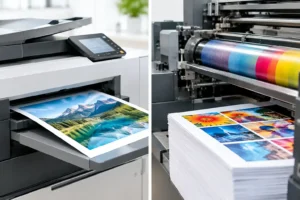
Digital Versus Offset Printing for Your Job
Digital versus offset printing explained for Australian businesses. Compare cost, speed, colour, quantities and the right choice for your next print run.

A great product can lose the sale in a second if its packaging looks unclear, cheap or hard to trust. Product labels do much more than state what is inside the jar, bottle, box or pouch. They carry your brand into a customer’s hands, answer practical questions and help your product hold its own on a crowded shelf, market table or delivery photo.
For Australian small businesses, the right label is rarely about choosing the fanciest option. It is about matching the material, shape and finish to where the product will be used. A label for a hand-poured candle has different demands from one for a refrigerated sauce, a construction product or a takeaway coffee bag.
Before choosing colours or finishes, consider the conditions your label will face. Is it going onto smooth glass, textured cardboard, a flexible pouch or a curved bottle? Will it be handled constantly, exposed to condensation, kept in a fridge or left in the sun? These details affect how well a label applies, how it looks over time and whether customers can still read it when it matters.
Paper labels are a strong option for dry products, gift packaging, retail boxes and short-run promotions. They have a familiar, tactile feel and can give food, candles, cosmetics and handmade goods a warm, premium look. They are not the best choice where water, oil or heavy handling is part of everyday use.
Vinyl labels are made for tougher work. They suit products that may get wet, travel in esky bags, sit outdoors or be used in workshops and on job sites. Their durability is a practical investment when a peeling or smudged label would make your brand look careless.
Clear labels work particularly well when you want the packaging itself to show through. Think clear jars, bottles and windows in product boxes. Adding white ink behind selected artwork keeps light colours and fine details visible, rather than letting them disappear against the contents. Metallic gold or silver finishes can add a polished touch for premium ranges, but they work best when used with restraint. A clean logo detail often has more impact than a label crowded with effects.
A customer should be able to work out what your product is within a few seconds. That sounds obvious, yet many labels become overloaded when every message feels essential. Your product name, brand and key product benefit need room to breathe.
A simple hierarchy helps. Lead with the brand or product name, then add the most useful detail such as flavour, scent, size, strength or variant. Supporting information can sit lower on the label or move to the back. If you sell chilli sauce, for example, “Smoky Habanero” and the heat level may matter more at first glance than a long paragraph about the recipe.
Use contrast rather than relying on tiny type or busy backgrounds. Dark text on a light area, or light text on a dark area, generally reads better from a distance. If your product is stocked in stores, test the design at arm’s length. If the key wording disappears, simplify it before printing.
A label shape should follow the packaging, not fight it. Rectangles and squares are efficient, versatile choices for bottles, tins, pouches and boxes. Circles can soften the look of jars, lids and candle vessels. Custom die-cut labels are worth considering when your logo or illustration has a distinctive silhouette that adds recognisable character.
Curved containers need extra care. A large label may crease on a narrow bottle or wrap too far around the sides, making copy hard to read. Measuring the flat or usable area of the container before ordering saves rework later. If you are unsure, apply a paper mock-up first and check where the edges land.
Good label design balances personality with clear information. What you need to include depends on the product category, the claims you make and where you sell it. Food, cosmetics, cleaning products and goods with safety considerations can each carry specific requirements, so check the relevant Australian rules for your product before sending artwork to print.
In most cases, practical details should be legible and logically grouped. That may include ingredients, allergen information, directions, storage advice, volume or weight, batch details, warnings, contact details and barcodes. Leave sufficient space for variable details such as batch numbers or best-before dates if these are stamped or written on after printing.
A barcode deserves its own clear area with good contrast. Avoid placing it over a textured image, metallic effect or curved edge. Retail scanners are not impressed by artistic ambition.
Screen artwork can look different once it becomes a physical label. Fine lines, pale text and small reversed-out details may look sharp on a large monitor but become difficult to reproduce or read at label size. This is especially true for designs viewed in a hurry, such as a shopper comparing products on a shelf.
Keep important text comfortably sized and use high-resolution images. If you are supplying logos or illustrations, vector artwork is ideal because it stays crisp at different sizes. PDFs with outlined fonts are generally a safe choice for finished files, while high-quality PNGs can work for simpler designs. Avoid screenshots, blurry images pulled from social media and artwork with text sitting too close to the edge.
Bleed matters too. If colour or imagery runs right to the edge of the label, extend it slightly beyond the final cut line so there is no accidental white sliver after trimming. Keep vital wording and logos inside a safe margin. These small production details are what separate a label that looks homemade from one that looks retail-ready.
Not everyone has print-ready files, and that should not hold up a good product launch. Fast Stickers offers free artwork help and unlimited proof revisions, so you can turn a rough concept, logo or existing packaging into a label designed for print. Checking a proof carefully is still essential. Read every word, confirm the size and review colours on the actual product pack before approving it.
Ordering the lowest possible quantity can feel sensible at first, but it can create headaches if you are constantly running short during busy periods. Look at your average production run, then add a buffer for damaged labels, samples, photography, markets and unexpected orders.
Sticker rolls are a practical choice when you label products regularly. They are quick to peel and apply by hand, easy to store and useful for packing benches. Individual die-cut labels can make more sense for limited releases, promotional inserts or products with unusual shapes.
It also pays to think ahead about product variations. If you have five candle scents or six sauce flavours, keep the overall layout consistent and change only the colour, name or key detail. This makes your range easier to recognise and gives future reprints a faster, cleaner workflow.
The right label depends on the real-world environment, not just a digital proof. Apply a sample to the finished packaging and leave it where customers will use it. Put a drink label in the fridge, handle a bottle with damp hands or leave an outdoor product in the sun. Check whether edges lift, colours stay clear and the label still feels right in the hand.
This step is particularly valuable for glass, low-energy plastics, textured surfaces and packaging that changes temperature. Adhesives can perform differently depending on the surface and conditions. A quick test beats discovering a problem after hundreds of units are packed.
Product labels are one of the few brand touchpoints customers physically interact with. A well-chosen label can make a simple package feel polished, help a customer find the information they need and give a small business the confidence of a much bigger brand.
Keep the first version clear, durable and true to the product. Once that foundation is working, you can experiment with seasonal runs, special finishes or limited-edition designs without losing the consistency customers remember. The best label is not just attractive on screen – it earns its place on every product you send out.
Digital versus offset printing explained for Australian businesses. Compare cost, speed, colour, quantities and the right choice for your next print run.
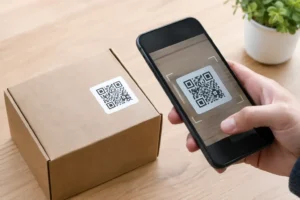
Creating QR code stickers for packaging, shops and events? Get the design, sizing, testing and material choices so every scan works in Australia.
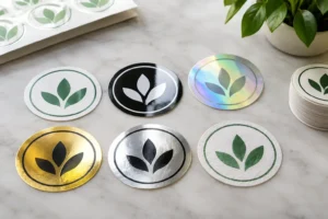
Compare popular sticker finishes for branding, from gloss and matte to clear, metallic and more, so every label, product or promotion looks spot on too.
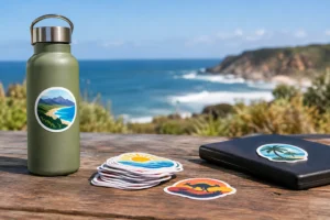
Choose outdoor sticker materials that stand up to sun, rain, salt spray and daily wear, with practical advice for labels, vehicles, windows, gear and more.
Need a sticker artwork design service? Get print-ready designs, unlimited proof changes and durable custom stickers made for tough Australian weather, promptly.