
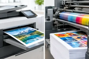
Digital Versus Offset Printing for Your Job
Digital versus offset printing explained for Australian businesses. Compare cost, speed, colour, quantities and the right choice for your next print run.
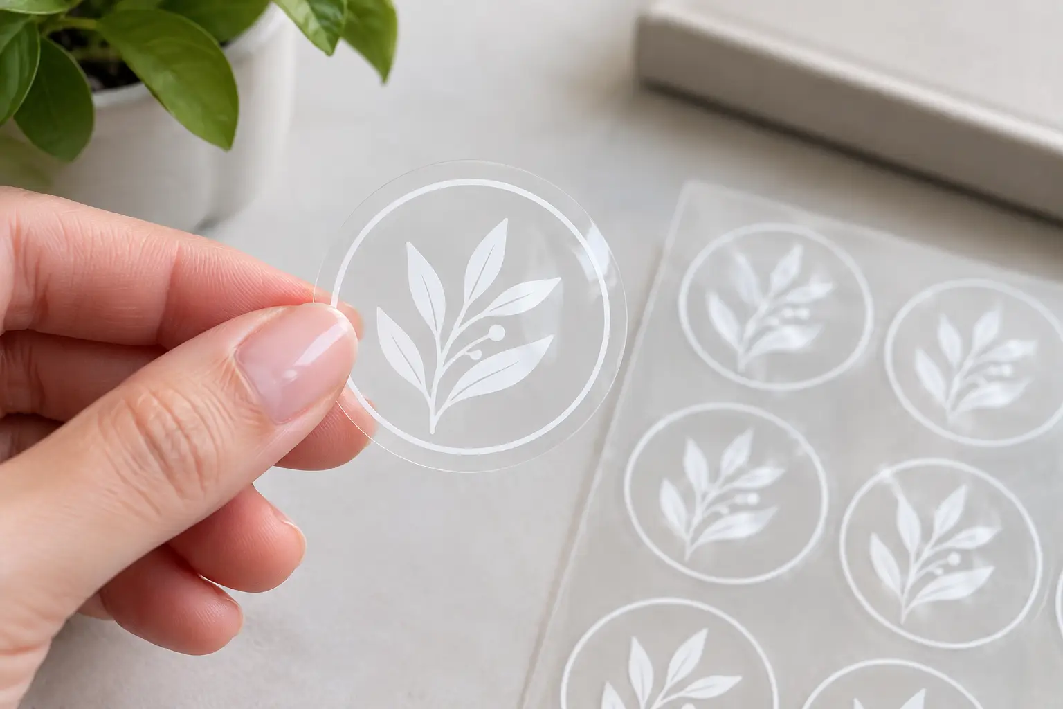
A clear sticker can look brilliant in a proof and nearly disappear once it is applied to a dark bottle, tinted window or colourful package. That is where clear stickers with white ink earn their place. A layer of white ink gives your artwork a solid base, keeps colours true and makes fine details far easier to read without giving up the clean, see-through finish around the design.
For product brands, cafés, retailers, tradies and event organisers, this creates a polished label that looks like it belongs on the surface rather than sitting on top of it. The trick is deciding exactly where white needs to print, and where the clear material should stay visible.
Most printing inks are translucent to some degree. Printed directly onto clear material, colours pick up whatever is behind them. A yellow logo may look bright on a white jar but muddy on a kraft box. Blue type can disappear against a dark glass bottle. Even black artwork can lose crispness depending on the surface.
White ink acts as an underbase. It is printed beneath selected coloured elements, creating an opaque layer between the artwork and the surface underneath. Your colours then have a neutral background to sit on, much like they would on white vinyl.
White ink can also be printed as the visible artwork itself. This is ideal for white lettering on shopfront windows, wedding welcome decals, boat names or simple designs on dark packaging. In some jobs, it does both: white appears in the design and sits underneath the colour sections that need extra punch.
The important point is that white ink is not automatically required across the whole sticker. Used carefully, it gives you control over what stands out and what stays transparent.
Clear stickers work best when the surface behind them is part of the look. Think of a clear cosmetic jar, a chilled-drink bottle, a glass door or a laptop where you want the original finish to remain visible. White ink lets the key information stay readable while leaving open areas clear.
They are a strong fit for branded product packaging. A logo printed with a white underbase can sit cleanly on a bottle or container, while the unprinted edge blends into the pack. This can make a small label feel less bulky than a standard white sticker.
Window graphics are another practical use. White text and icons are easy to see on glass, and clear areas let in natural light. For temporary promotions, opening hours, QR codes or a simple logo, the result is sharp without covering the entire pane.
Clear stickers are also popular for party favours, candles, jars, wedding stationery and personalised gifts. A clear label with white and coloured print can make an ordinary container feel custom-made. On vehicles, boats and equipment, the design can look especially tidy when the background surface is worth showing off.
That said, clear is not always the best answer. If you need a bright full-colour design with no interaction from the surface beneath, white vinyl may be the more reliable option. Clear material also shows bubbles, dust and crooked application more readily, especially on glass. For heavily textured surfaces, a high-tack material may be better suited than a clear sticker.
There are three common ways to use white ink, and the best one depends on the final look you are chasing.
This is the most versatile option. White prints beneath your coloured logo, illustration or text, helping every colour stay bold on the chosen surface. It suits product labels where consistency matters, particularly if the stickers will be applied to more than one packaging colour.
A full underbase gives the strongest colour result, but it also reduces the transparent effect behind the printed artwork. The clear border and any intentionally unprinted sections still remain see-through.
Spot white means white ink is used only in nominated areas. You might place it behind the logo and ingredients panel, but leave decorative leaves, windows or background elements clear. This approach creates more depth and makes the transparent material an active part of the design.
It takes a little more planning, but the result can look premium and deliberate. It is a good choice when you want a clear sticker to feel airy rather than fully opaque.
Here, white is the feature. Clean white type, line art or symbols look excellent on dark glass, black packaging, vehicle windows and coloured containers. Pair it with one strong colour and the design stays easy to read from a distance.
Fine white lines can work well, but avoid pushing details too small. A slightly thicker stroke generally prints and reads better, particularly for stickers that will be viewed on a shelf or through a shop window.
A file can look perfect against a white artboard and still fail once it lands on a green bottle or a timber sign. Before finalising your design, consider where the sticker will live. Is the surface pale, dark, metallic, clear, textured or constantly handled? Will customers read it up close, or from across a counter?
Contrast should lead every decision. Dark text needs a white underbase on dark or busy surfaces. Pale colours such as yellow, pastel pink and light blue nearly always benefit from one. If the sticker will be applied to clear glass, remember that people may see it from both sides. Reversed artwork may be worth considering for inside-window applications.
Keep vital details away from the edge. This includes phone numbers, small text, QR codes and logo elements. A little breathing room makes trimming more forgiving and helps the finished sticker look cleaner.
Shape matters too. A simple die-cut outline can follow your logo, while a rectangle or circle often suits product labels and makes application quicker. If your artwork has lots of tiny cut-outs or very narrow points, simplify the outline. Stronger shapes are easier to peel, apply and keep looking good over time.
Start with the best file you have. Vector artwork is ideal for logos and line art because it stays sharp at any size. High-resolution PDF, AI, EPS or SVG files are typically best for print-ready designs. A high-quality PNG can also work for simpler artwork, provided it is supplied at the final print size and is not blurry.
Use solid colours where possible and make small type large enough to read in real life. If a customer needs to scan a QR code, test it at the intended sticker size before ordering. Clear material can make weak contrast more obvious, so do not rely on a pale code over a transparent area.
If you are unsure which elements need white ink, mark up a rough version of the design or explain the intended application. A clear instruction such as “white behind the logo and text, clear leaves around it” removes guesswork. Fast Stickers can help prepare artwork and provide proof revisions, which is particularly useful when you have an idea but not a finished print file.
The surface needs to be clean, dry and free from oil, dust and condensation. On bottles and jars, wipe the application area first and allow it to dry completely. Even a tiny speck trapped beneath a clear sticker can be noticeable.
Apply from one edge and press across gradually with a soft cloth or plastic card. Avoid dropping the sticker flat onto the surface, as this can trap air. For larger decals, take your time and work from the centre outwards.
Curved containers need extra care. A wide, rigid sticker can wrinkle around a tight curve, so choose a size and shape that match the container. Sometimes a smaller label, a narrower design or separate front-and-back stickers will give a much neater result.
The best clear sticker designs do not treat transparency as an afterthought. They use it to frame the product, show the material beneath or create contrast between solid printed details and open space. White ink gives you the control to do that without sacrificing legibility.
If you need a label that looks clean on the shelf, a window decal that reads from the footpath or a custom design that feels properly finished, start with the surface it will be applied to. From there, white ink becomes a practical design tool, not just an extra print option.
Digital versus offset printing explained for Australian businesses. Compare cost, speed, colour, quantities and the right choice for your next print run.

Creating QR code stickers for packaging, shops and events? Get the design, sizing, testing and material choices so every scan works in Australia.
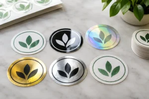
Compare popular sticker finishes for branding, from gloss and matte to clear, metallic and more, so every label, product or promotion looks spot on too.

Choose outdoor sticker materials that stand up to sun, rain, salt spray and daily wear, with practical advice for labels, vehicles, windows, gear and more.
Need a sticker artwork design service? Get print-ready designs, unlimited proof changes and durable custom stickers made for tough Australian weather, promptly.