

Custom Stickers Melbourne
Custom Stickers Melbourne: The Complete 2026 Guide for Victorian Businesses Picture this: it’s a Thursday afternoon in a Brunswick café. The new logo finally landed
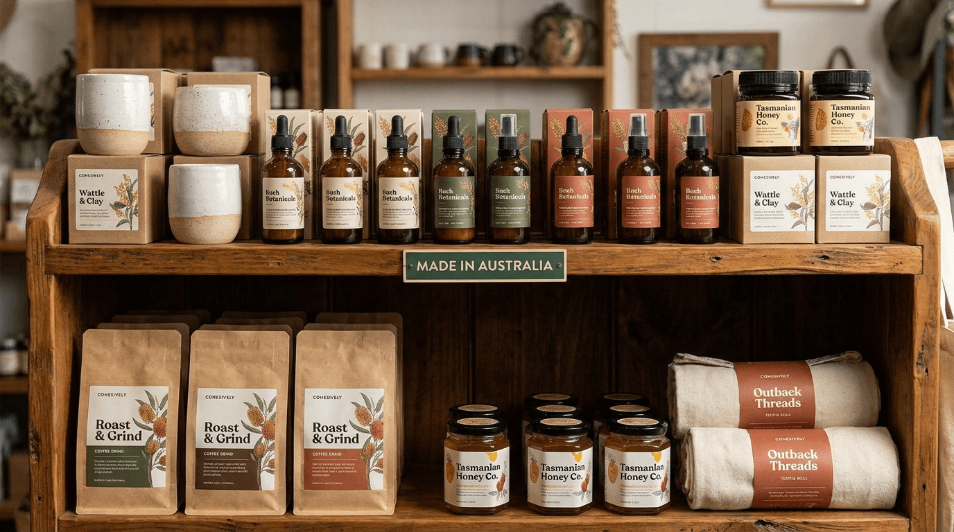
Picture this: it’s 9pm on a Tuesday in a spare room in Bendigo, and you’re sitting cross-legged on the floor because the table ran out of space three hours ago. Boxes are stacked against the wall. The market is Saturday. In front of you is a carton of 200 glass jars, filled and capped and looking exactly the way you imagined them — and beside it, a stack of product labels that are five millimetres too wide. You’ve already stuck one on. It tented at the edge, lifted at the corner, and now it looks like a sticker rather than a brand.
There’s no fixing that after printing. And it almost never happens because someone chose the wrong picture. It happens because the decisions that actually matter — format, size and material — get made last, or not at all, while everyone’s attention goes to the design.
This guide is about those decisions. It’s written for e-commerce sellers, makers and artisans, food and drink producers, and small product businesses who buy labels in volume and keep reordering them. It covers the business-level choices: what format your product labels and packaging stickers should arrive in, how to size them for the container you’re actually holding, what material survives the journey, and how much to order so you’re not paying setup twice. Where you need depth on materials, artwork or compliance, there are dedicated guides linked throughout.
By the end, you’ll know exactly what to order, and why.

Before we get to the decisions this guide is really about, let’s get the basics out of the way — and point you to the deep dives if you need them.
Product labels carry information and identity on the product itself: the jar, the bottle, the tub, the pouch. Packaging stickers work on the outside — the mailer, the box, the tissue paper, the parcel your customer sees before they see anything else. Most product businesses end up buying both, and the two jobs pull in slightly different directions, which is exactly why bundling them into one decision causes trouble.
Here’s the run of foundational topics, each with one sentence and a pointer. If any of these is your actual question, follow the link — that’s where the real answer lives.
Compliance deserves the same treatment: if you’re selling food, candles or honey, there are labelling requirements you need to meet before you print anything, and those are handled in detail in the guides to food labelling requirements, candle labelling and honey and jar labels. This article won’t attempt regulatory detail — that’s specialist ground and it belongs in those posts.
So what’s left? The part nobody writes about, and the part that determines whether your order arrives usable.
There are three decisions that shape everything about how custom product labels work in an Australian small business, and they get made in this order:
Design matters. Materials matter. But those three decisions are the ones that determine whether the box that lands on your doorstep is an asset or a very tidy pile of waste. Let’s start with the one that changes what physically arrives.
Format is the most consequential choice a growing product business makes, and the least understood. It’s rarely presented as a choice at all — you browse, you find a design you like, and the format comes along with it almost by accident. Then six months later you’re standing at a bench at 11pm peeling labels off sheets one at a time and wondering why this takes so long.
Let’s be precise about what each format actually is.
Roll labels arrive wound onto a core. The labels sit in a continuous sequence on a backing liner, and you peel them off one after another as you work. The roll unwinds, you take the next label, you stick it on, you take the next one. There’s no hunting, no repositioning, no picking at a corner to lift an edge.
Sheet labels arrive as multiple labels arranged on a flat backing sheet, usually kiss-cut so the face material lifts away cleanly while the backing stays intact. You locate a label, lift it, apply it, then go back to the sheet for the next one. Sheets can hold several different designs at once, which is their real advantage.
Individual die-cut labels are cut to their finished shape and supplied loose or singly. They’re the format for complex outlines and for anything where the shape itself is doing branding work.
Forget aesthetics for a moment. Format is decided by three things.
Order volume. Low and irregular volumes suit sheets. If you’re producing thirty units of something this month and none next month, or you’re running six different small-batch products with different artwork, sheets let you hold a small, varied stock without committing to a long run of any single design. Consistent volume and repeat runs favour rolls — the moment you know you’ll be applying the same label to the same product every week, rolls become the sensible default.
Application speed. This is where the gap between formats becomes physical. Rolls peel in sequence, which is dramatically faster across hundreds of units because the next label is always exactly where your hand already is. Sheets require locating and lifting each label, and that small friction — half a second of finding the edge, a moment of getting a fingernail under it — multiplies brutally across a long session. At forty units nobody notices. At four hundred it’s the difference between an evening and a weekend.
Hand-applied versus applicator or machine. This is the decisive one. Handheld applicators and labelling machines require roll format, full stop. There is no adapter, no workaround, no clever way to feed sheets through a device designed for a continuous liner. If there is any chance you’ll mechanise later — and most businesses that keep growing eventually do — rolls are the format to standardise on now, before you’ve built a design system and a reorder rhythm around something you’ll have to abandon.
There’s a fourth practical consideration that sits slightly apart from the framework: shape freedom. Complex outlines, irregular silhouettes and shapes that follow an illustration rather than a rectangle don’t suit rolls and sheets as neatly, because both formats are built around efficient, repeatable arrangement on a liner. Individual die-cut stickers are the format built for exactly that, and if you want the detail on how the cutting works, the complete guide to die-cut stickers covers what this section deliberately skips.
| Roll labels | Sheet labels | Individual die-cut | |
|---|---|---|---|
| Best for | Consistent, repeating volume | Low or irregular volume, multiple designs | Complex shapes, premium one-offs |
| Application speed | Fastest — peels in sequence | Moderate | Slowest per unit |
| Works with an applicator | Yes | No | No |
| Typical use | Jars, bottles, tubs, pouches | Mixed small batches, market stock | Feature stickers, hero branding |
| Per-unit cost at volume | Lowest | Moderate | Highest |
| Storage | Compact on the core | Bulky, sheets can curl | Loose, easy to misplace |
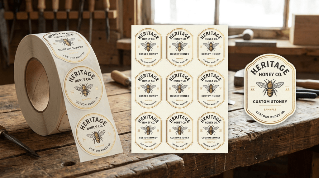
Most guides at this point say “it depends.” Here’s a straight answer instead.
Testing your first product, or running an unpredictable schedule? Sheets or small die-cut runs. You don’t yet know whether this product will still be in your range in six months, and there’s no sense standardising a supply chain around a hypothesis. Sheets let you carry a small mixed stock, adjust quickly, and change your mind without waste.
Steady weekly or fortnightly orders? Rolls. This is the threshold. Once you’re applying the same label to the same product on a regular cycle, the speed advantage compounds every single week, the per-unit cost at volume drops, and you’ve positioned yourself to add an applicator later without re-engineering anything. Custom sticker rolls are the workhorse format for Australian product businesses for exactly this reason — they store compactly on the core, they don’t curl the way sheets do in a humid shed over summer, and they turn labelling from a fiddly task into a rhythm. Whether you need vinyl sticker rolls or paper sticker rolls comes down to exposure rather than format, which is the next section’s territory.
Multiple SKUs with different artwork? Order separate roll runs per SKU rather than mixed sheets. This feels counterintuitive — surely one mixed sheet is tidier than five rolls? — but in practice mixed sheets force you to sort while you work, and sorting is exactly the friction that makes labelling miserable. Separate rolls let you batch: label all of one product, put the roll down, pick up the next. Cleaner, faster, and far less prone to the kind of mistake you only notice after the parcel’s gone.
A note on label rolls in Australia specifically: the compact storage matters more here than people expect. A roll on a core tolerates a warm garage or a storeroom in a Queensland February far better than a stack of sheets, which will curl at the edges and start fighting you long before the artwork has faded. That’s a small thing until it isn’t.
Format settled, the next question is the one that causes the most expensive mistakes — whether the label actually fits the container.
Here’s the failure mode, and it’s so common it’s almost a rite of passage. You choose a size on a screen. The number looks reasonable. You approve it, it prints, it arrives, and then you bring it into contact with a curved piece of glass and discover that five millimetres is an enormous amount of distance when it’s being wrapped around a radius.
There is no fixing this after printing. You can’t trim a printed label neatly by hand across hundreds of units, and even if you could, the artwork would no longer be centred. This section exists to make sure that never happens to you.
On a curved container, width is the constraint that governs everything. A label being wrapped around a cylinder is being asked to conform to a curve in one direction while staying flat in the other. The tighter the radius, the more the material resists — and it expresses that resistance by lifting at the edges, wrinkling along the leading edge, or tenting where it can’t quite make contact.
This effect scales with diameter. On a wide-mouth 500ml jar the curve is gentle and the label barely notices. On a lip balm tub, a 30ml sample jar, a slim bottle or one of those tall test-tube-style spice containers, the radius is tight enough that a label a few millimetres too wide simply will not sit down. The smaller the diameter, the more conservative the width must be.
Height, by contrast, is forgiving. A label that’s two millimetres shorter than you intended looks like a design decision. A label two millimetres too wide looks like a mistake. When you’re uncertain, take the width down and leave the height alone.
Do this with the container in your hand. It takes about ten minutes and it’s the highest-return ten minutes in this entire guide.
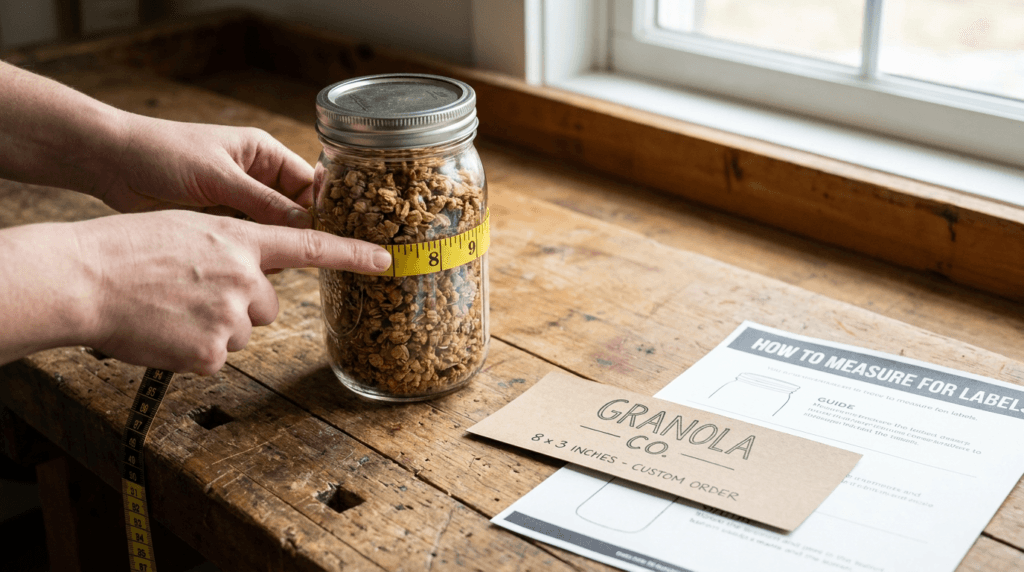
Jars. Shoulder clearance is the recurring issue, particularly on jars with a pronounced curve near the lid. Give yourself a few millimetres of breathing room at the top rather than pushing the label as high as it will technically go. If the lid also needs a seal or a top label, treat that as a separate circular item and measure the flat portion of the lid, not its outer diameter — many lids have a raised or knurled rim that a full-diameter circle will fight. Jar sellers who want category-specific detail will find it in the guide to honey and jar labels.
Bottles. You have a genuine choice here: a tall narrow label on the front panel, or a wrap. Tall narrow labels suit slim bottles and premium positioning, and they’re more forgiving because you’re only asking the material to bend across a small width. Wraps give you far more surface for information — useful when you have ingredients, directions and a story to fit — but they demand accurate circumference measurement and a planned overlap. Watch for bottles that taper: a rectangle applied to a tapered surface will look crooked even when it’s perfectly straight, because the eye reads it against the sloping edge.
Stand-up pouches. The surface is flexible, which sounds easier and isn’t quite. Pouches flex in the hand, so a large rigid label can crease when the pouch is squeezed. Keep to the front panel, stay clear of the gusset and the seals at the edges, and remember that the panel changes shape depending on how full the pouch is — measure it filled, not flat.
Tubs. Decide early whether the lid or the side is your primary surface. Lid labels are seen first when tubs are stacked or displayed in a fridge; side labels are seen on a shelf. Many products use both — a circular lid label carrying the logo and a rectangular side label carrying the detail. If your tub has a tamper ridge or a rolled rim, measure the flat area inside it.
Mailers and boxes. Different problem entirely. Here you’re placing rather than fitting, and the two things that matter are seal placement and corner clearance. A seal that sits across the closure flap does a job — it holds the parcel shut and signals it hasn’t been opened. A sticker placed too close to a corner or an edge will catch during transit and start peeling before it reaches your customer. Keep packaging stickers well inside the panel, and if you’re sealing a satchel, place the seal where the flap actually meets the body rather than where it looks best in a flat mock-up.
Rectangles and rounded rectangles are the most forgiving shapes on curved surfaces, because their edges run parallel to the direction of the curve and they distribute the stress evenly. Rounded corners are a genuine functional upgrade over square ones — sharp corners are the first thing to lift, catch and peel.
Circles suit lids, seals and flat panels. On a curved side, a large circle has to conform in two directions at once, which is where puckering starts.
Complex outlines are best reserved for flat surfaces. A beautifully die-cut shape on a mailer or a flat pouch panel looks exceptional. The same shape wrapped around a 40mm jar will fight you at every point where the outline runs perpendicular to the curve.
Once you’ve settled your dimensions, the artwork needs to be built to them properly — bleed, resolution and colour handling all have to match the finished size, and the artwork and print quality guide walks through the specifications. If you’d rather not set the file up yourself, the free design service will build artwork to a confirmed size with unlimited revisions, and a proof is sent for approval before anything goes to print — which means the dimensions get a second set of eyes before they’re committed. If your container is genuinely unusual and you want a human to sanity-check the sizing before you commit, get a quote and describe what you’re labelling.
With size confirmed, the next variable is what the label is made of — because the container’s contents and its journey decide that.
Material selection goes wrong when it’s treated as a preference. The question is not which material do I like. The question is what will this label endure between the moment it’s printed and the moment it’s sitting in your customer’s cupboard, and what’s the worst thing that happens to it along the way?
Choose for the harshest moment the label will face, not the average one.
That principle does more work than any material chart, because labels don’t fail during the average moment. They fail in the one hour the carton spends in the back of a van in Perth in January. They fail in the condensation that forms when a chilled bottle comes out of the fridge on a humid Brisbane afternoon. They fail on the market stall in February when the sun swings around at two o’clock and hits the table directly.
Let’s name the real conditions rather than gesturing at “harsh environments.”
Summer heat in transit. A parcel in a delivery van or a car boot on a hot day reaches temperatures well beyond anything the product will see in normal use. Adhesives soften, and a label that was applied slightly imperfectly will find that heat and start to lift.
Humidity. Queensland, the Top End and the tropics put a constant moisture load on everything. Paper stock absorbs it, softens and can start to look tired even without direct contact with water. Coastal humidity does a gentler version of the same thing year-round.
Condensation. This is the one that catches out drink producers. A refrigerated product doesn’t just have to survive being cold — it has to survive the film of water that forms the moment it comes out of the fridge into warm air. That’s repeated wetting and drying, over and over.
UV exposure. Anything sold outdoors, displayed in a shopfront window, or stored where the afternoon sun reaches it is being slowly bleached. Australian UV is genuinely more punishing than most of the world’s, and it shows up as faded reds and washed-out brand colours long before the material itself fails.
Oil and grease. Skincare, balms, cooking oils, sauces, anything with a lid that gets handled with product still on the fingers. Oil creeps under an unsuitable label edge and travels.
Wet areas and hand-washing. Bathroom shelves, kitchen sinks, anything a customer will rinse. Reusable and refillable containers face this repeatedly.
Materials are chosen to suit Australian climate extremes — that’s the baseline, but the specific stock and adhesive still need to match your specific product’s life.
This is the part most people miss. You’re making two choices, not one: what the label is made of, and how it sticks.
Permanent adhesive is the default for product labels. It’s designed to bond and stay bonded, and after a curing period it’s not coming off cleanly. That’s what you want on anything carrying your brand and your product information.
Removable adhesive peels away cleanly without leaving residue, which makes it right for promotional and seasonal labels, price and batch markings, anything a customer may want to peel off before reusing a jar, and any campaign element that shouldn’t outlast the campaign. Removable stickers are the sensible choice whenever the label’s job has an end date.
High-tack adhesive grips harder than standard, and it exists for the surfaces that defeat normal adhesive: textured, rough, powder-coated, low-energy plastics, corrugated card, tightly curved containers, and cold surfaces. If your labels keep lifting at one edge no matter how carefully you apply them, the answer is usually high-tack stickers rather than better technique.
| Container / exposure | Suggested stock | Adhesive | Why |
|---|---|---|---|
| Dry goods, pantry jars, boxes | Paper | Permanent | Cost-effective, no moisture load |
| Skincare, bathroom, wet areas | Vinyl | Permanent | Withstands moisture and handling |
| Refrigerated drinks, condensation | Vinyl | Permanent | Won’t soften or lift when damp |
| Frozen goods, cold chain | Vinyl | High-tack | Adhesive must bond at low temperature |
| Glass jars, “no-label” look | Clear | Permanent | Blends into the glass |
| Clear stock on dark contents | Clear with white ink | Permanent | White underbase keeps colours true |
| Outdoor, UV-exposed, vehicles | Vinyl | Permanent | UV and weather durability |
| Promotional, seasonal, temporary | Paper or vinyl | Removable | Peels cleanly when the run ends |
| Textured, curved or awkward surfaces | Vinyl | High-tack | Grips where standard adhesive lifts |
A few rows deserve a sentence of context.
The frozen row is its own discipline — adhesives behave differently when they’re asked to bond at low temperature or to a surface that’s already frozen, and the full picture is in the guide to freezer and cold-chain labels.
The two clear rows are the ones jar and bottle sellers ask about constantly. Clear stickers give you the printed-straight-onto-the-glass effect that reads as premium, but clear stock is transparent — whatever is behind it shows through, so light-coloured artwork over dark contents will disappear. That’s what clear stickers with white ink solve, by laying down a white underbase beneath the colours so they print true. The full comparison sits in clear stickers versus white stickers.
And the stock column overall — paper versus vinyl, when each is the right call and where each fails — is owned entirely by vinyl versus paper stickers. If you’re weighing durability against sustainability, which more makers are every year, the options are laid out in eco-friendly sticker materials.
Material and format sorted, there’s still the part nobody warns you about — actually getting hundreds of these onto products by hand.
Applying forty labels is a pleasant half-hour with a podcast on. Applying four hundred is a completely different task, and — this is the bit that surprises people — the technique that works fine at forty actively falls apart at four hundred.
At small volumes you can afford to be casual. Peel the whole backing off, hold the label by its edges, hover it over the jar, drop it on, adjust. It works. At scale, that same approach produces a slow drift into inconsistency: labels a few millimetres higher on some units than others, a bubble here, a crooked one there, and a growing pile of jars you’ve quietly set aside to redo.
The good news is that the fixes are technique, not talent.
This is the single highest-value technique in this section, and it converts label application from a one-shot placement into a correctable one.
That’s it. It takes slightly longer per label than the drop-and-hope approach for the first ten, and then it’s faster forever, because you stop redoing things.

Bubbles are trapped air, and trapped air happens when a label makes contact at several points at once and the air between them has nowhere to escape.
The fix is to establish a single contact line and work outward from it. Never press a label down flat all at once. On a flat surface, tack one edge and sweep across. On a curved container, apply the centre vertical line first, then work out to each edge in turn — the curve is naturally pushing the edges away from the surface, so you’re always chasing air toward an open edge rather than sealing it in.
Smooth with a steady sweep using the flat of your finger, the side of your hand or a soft card edge — not fingertips. Fingertips press in points, and points create exactly the multiple-contact problem you’re trying to avoid. A steady, continuous sweep moves the air ahead of it.
If a bubble does form and it’s small, resist the urge to press it flat. Air compresses and then re-expands. Lift the nearest edge slightly, let it out, and lay it back down.
Here’s something you only discover once your products sit next to each other on a shelf: eyeballing drifts. You will start the batch placing labels at one height and finish it placing them somewhere slightly different, and you won’t notice while you’re doing it. It’s only visible when six jars line up and the labels form a gentle staircase.
The fix is embarrassingly simple. Use a physical jig or bench mark. This can be as basic as a strip of timber clamped to the bench at the right height, a line of masking tape on the wall behind your workspace, or a shallow box that holds the container at a consistent position. Anything that gives you a fixed physical reference rather than a judgement call.
You make the alignment decision once, at the start, and then you stop making it. That’s the whole trick — removing a repeated decision from a repetitive task is what makes repetitive tasks fast.
Most lifting-edge problems are surface problems, not adhesive problems.
Surfaces bond best when they’re clean, dry and at room temperature. Clean means free of dust, residue and — critically for anyone doing their own filling — any trace of the product itself. A film of oil or wax on the outside of a jar is invisible and completely defeats an adhesive.
Dry matters more than people expect. Applying labels to containers that have just been washed, or that have come out of a fridge and are carrying condensation, is the single most common cause of edges lifting a day later. Cold containers are the same story: the adhesive doesn’t reach its intended tack at low temperature, and the bond it forms is a fraction of what it should be. If you’ve refrigerated something, let it come back to room temperature before labelling.
If you’ve done all of this and labels still lift, the surface may simply be difficult — textured, powder-coated or a low-energy plastic — and that’s the point where high-tack stickers solve a problem that technique can’t.
This isn’t a product pitch, it’s a threshold decision, and there are three honest signals.
Time. When a labelling session regularly costs more hours than those hours are worth to your business. Every hour spent labelling is an hour not spent making, selling or resting, and there’s a point where the maths turns.
Consistency. When variation across a batch starts affecting how the product presents. If you’ve started noticing the staircase effect and a jig isn’t enough, an applicator removes human variance entirely.
Repetition. When you’re running the same SKU over and over. Applicators reward repetition — the setup cost, in time and money, amortises across identical units.
And here’s where the earlier format decision comes home to roost: applicators need roll labels. If you’re anywhere near this threshold, or you can see it from where you’re standing, standardise on vinyl sticker rolls now rather than discovering later that your entire label stock is in a format your new equipment can’t use. Format standardisation is cheap when you do it early and expensive when you do it under pressure.
Be honest with yourself about timing. Hand application is slower than almost everyone estimates, especially the first time. Speed improves substantially once the hinge method becomes automatic and a jig removes the alignment decisions, but the first batch of a new product is always the slow one. Build that into your schedule rather than discovering it at midnight.
A few workflow habits that make a real difference:
Once the labels are on the products, attention moves outward — to everything else the customer touches when the parcel arrives.
There’s a persistent assumption that branded packaging means spending money on a premium box. It doesn’t. Branded packaging isn’t one expensive item — it’s several modest ones working in concert.
A plain kraft mailer with a well-placed seal in your brand colour reads as more considered than an expensive rigid box with nothing on it at all. The mailer costs a fraction as much. The difference is that one of them looks like a decision and the other looks like a purchase.
That’s the reframe worth holding onto: your customer isn’t assessing your budget, they’re reading for evidence of care. Packaging stickers are the cheapest possible way to leave that evidence everywhere they look.
Each of these has a specific job. You don’t need all of them, and you certainly don’t need all of them at once.
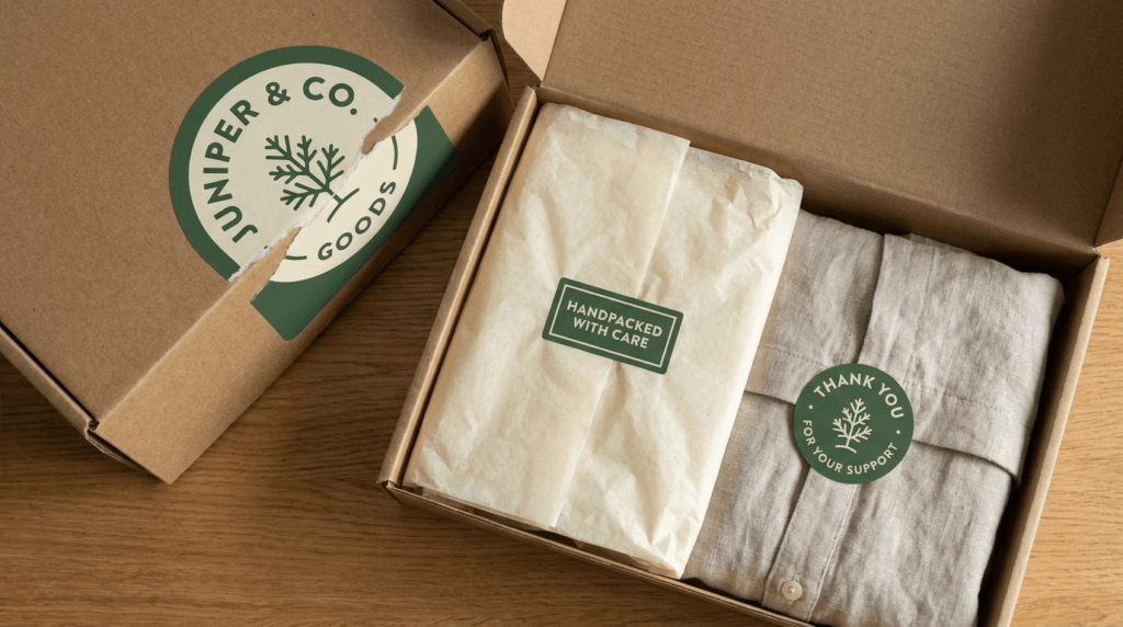
Cohesion is not a budget problem, it’s a discipline problem. Here’s how to build it in stages.
Stage one: standardise your constants. Pick one or two brand colours and a single logo mark, and use them across every sticker you order without exception. Not similar colours. The same ones. This single act of restraint does more for perceived brand quality than any individual design choice, because the human eye reads repetition as intention.
Stage two: start with one versatile item. Rather than commissioning five bespoke stickers for five jobs, order one well-designed circular seal in a reasonable quantity and use it in several places — sealing the mailer, holding the tissue paper, closing the box flap. One design, one order, three jobs. It looks deliberate, and it’s a fraction of the cost of five separate short runs.
Stage three: add components only once the first is reordering reliably. When you find yourself reordering that circular seal on a predictable cycle, you’ve proven the volume. That’s the moment to add a second component — perhaps a rectangular thank-you sticker or a care label — rather than guessing at the start.
Stage four: keep the stock and finish consistent. If your product label is on a matte stock and your mailer seal arrives glossy, the kit reads as assembled from different places at different times, because it was. Matching stock and finish across components is a small specification detail that carries a disproportionate amount of the “this brand has its act together” signal.
Consistency reads as investment, even when it isn’t.
There’s a reason the one-versatile-seal approach works, and it’s economic rather than aesthetic. A single design ordered in a larger quantity is meaningfully more economical per unit than several designs each ordered in small quantities, because every separate design carries its own setup. Five small runs means paying to set up five times for a total quantity that might have cost less as one.
For a new business, that maths points clearly in one direction: fewer designs, ordered deeper. You get a lower per-unit cost, you’re less likely to run out mid-season, and — as a genuine side benefit — the constraint of using one sticker in multiple roles tends to produce a tighter, more coherent brand than having a bespoke item for every occasion.
For feature pieces where the shape itself is doing branding work — a thank-you sticker cut to your logo silhouette, a hero sticker customers might keep — die-cut stickers are worth the premium precisely because they’re the piece people notice. For seasonal and campaign elements that shouldn’t outlast the campaign, removable stickers let you overlay a Christmas or limited-edition message onto standard packaging without committing your permanent stock to a date. And if your packaging story is part of your positioning — which for a growing number of Australian makers it is — the eco-friendly sticker options are worth factoring in before you finalise the kit rather than after.
Maintaining consistency across components ordered months apart is exactly where the free design service earns its place: artwork can be produced across the whole kit with unlimited revisions, held to the same colours and specifications, and a proof is approved before printing every time — so the seal you reorder in November matches the one you first ordered in March. If you’re pricing a multi-component kit, get a quote with all the pieces listed together rather than costing them one at a time. And if you’d rather see what’s possible before you plan, the sticker shop is the place to browse the range.
A packaging system only works if it’s always in stock — which brings the guide to the numbers behind ordering.
Now for the part that quietly decides whether your labelling is a cost or an efficiency: how many to order, and when.
Print pricing confuses people because it doesn’t behave the way retail pricing does. Buying two of something in a shop costs twice as much as buying one. Printing two hundred labels does not cost twice as much as printing one hundred.
The reason is that a substantial share of any print run’s cost sits in setup rather than in the labels themselves. Preparing the file, setting the press, configuring the cut, running the first passes to get colour right — that work happens once, whether the run is fifty labels or five thousand. Once the press is running, each additional label adds only its incremental cost.
The practical consequence is a curve, not a line. Per-unit cost falls steeply as quantity rises from very small numbers, then flattens out. Doubling a small order rarely doubles the price — often it’s a modest increase for twice the stock.
This matters because it inverts the instinct most small businesses have. Ordering the smallest quantity you can get away with feels prudent. In print, it’s usually the most expensive way to buy per unit, and it sets you up to pay setup again sooner than you needed to.
Three costs compound when you order short.
You pay setup twice. The single clearest one. Ordering half now and half in two months means paying to set up the same job twice, for the same total quantity.
You run out mid-season. This is the expensive one, because it doesn’t just cost money — it costs sales. Running out of labels during the Christmas market run or in the middle of a wholesale order means either pausing production or shipping something unlabelled, and neither is a good option when the calendar isn’t negotiable.
You risk variation between runs. Separate print runs of the same artwork, produced at different times, can carry small differences in colour or alignment. On most products this is invisible. On a shelf where two batches sit side by side, or on a product where a specific brand colour is doing the recognition work, it’s noticeable — and it’s entirely avoidable by ordering the quantity in one run.
Ordering short feels cautious. Usually it isn’t.
Here’s a workable method that doesn’t require a spreadsheet.
Step one: establish your monthly consumption. How many labels does a typical month actually use? Not a good month, not a quiet one — a typical one.
Step two: add an allowance for wastage. Real labelling produces losses: misapplied units, damaged labels, the ones peeled off and redone, the ones used for testing and mock-ups. Your consumption figure should be your product count plus a realistic allowance, not your product count alone.
Step three: set a reorder trigger. Reorder when your remaining stock drops to roughly one production-and-delivery cycle, plus a safety margin. Because most orders are printed within 2–3 business days and shipped with free express shipping Australia-wide, that cycle is genuinely short — the buffer maths is tighter than it would be with a longer lead time. But it should never be zero. Things go wrong in ways that aren’t the printer’s fault: a wholesale order lands unexpectedly, a batch of labels gets damaged, a week gets away from you.
The rolls point is worth restating here in an economic context: at the volumes where you’re reordering on a cycle, paper sticker rolls and vinyl sticker rolls give you the lowest per-unit cost and the most compact storage, which means holding a real buffer doesn’t cost you a shelf.
Product businesses in Australia run on a distinctive rhythm, and product label printing needs to sit ahead of it, not inside it.
Christmas market season and the spring–summer run. The markets start ramping up from spring and run hard through December. This is peak production and peak selling simultaneously, which means it’s the worst possible time to be organising a label order. Order in late winter or early spring for the whole run.
EOFY. End of financial year brings both an admin load and, for many businesses, a spending decision. If capital equipment or bulk stock is on the cards, June is when it gets decided — and it’s a sensible moment to place a larger label order against the year ahead.
Mother’s Day and Father’s Day. Both generate concentrated gift demand with a hard date. Special-edition or seasonal labels for these need to be ordered well before the production push starts.
The pre-Christmas shipping crush. The Australia Post network is at its busiest in the weeks before Christmas, and that’s also when your own dispatch volume peaks. Everything about December argues for having your labels already sitting on the shelf.
The recurring lesson across all of these: order the season’s labels before the season’s workload arrives, not during it. The businesses that find labelling stressful are almost always the ones doing it in the same fortnight as everything else.
If you’re running a range, three habits pay off. Order SKUs together where possible, so you’re consolidating setup rather than paying it repeatedly across separate orders. Keep artwork consistent across the range, so the products read as a family on a shelf and so any future reorder matches. And stagger your reorder dates deliberately so several SKUs don’t all run out in the same week — nothing turns a manageable reorder into a crisis faster than four products hitting zero simultaneously.
And if a deadline is genuinely tight? Call the main line and mention “URGENT”. The team will try to find a solution, even outside normal business hours. It’s not a guarantee and it shouldn’t be your plan, but it’s a real safety net — the detail on how urgent work is handled is set out in the guide to rush and urgent sticker orders.
For your own numbers on a specific run, get a quote with the quantity you think you need and the quantity one step above it. Seeing both figures side by side usually makes the decision for you.
Work through this before you place any label order. Every item on it corresponds to a mistake that’s expensive after printing and free to fix beforehand.
If the artwork item is the one holding you up, the artwork and print quality guide covers the specifications. And when the checklist is clear, the full sticker range is where planning turns into an order.
The checklist answers the “what do I do” — the FAQ mops up the specific questions readers still arrive with.
Product labels go on the product itself — the jar, bottle, tub or pouch — and carry your branding and product information. Packaging stickers go on the outside of the parcel: mailer seals, box seals, tissue paper stickers and thank-you stickers. Most product businesses use both, for different jobs.
The terminology overlaps constantly in everyday use, and the practical distinction is unpacked in stickers versus labels.
It depends on volume and whether you’ll ever use an applicator. Rolls suit consistent, repeating orders — they peel in sequence and apply far faster across large batches. Sheets suit low or irregular volumes and let you hold several designs at once. If you might mechanise later, choose rolls now, because applicators only accept roll format.
Measure the flat labelling area between the shoulder and the base — not the full container height — then measure the circumference to decide between a partial wrap and a full wrap. On curved containers, width is the constraint that matters most: the smaller the diameter, the more conservative your width needs to be, because an over-wide label will lift and tent at the edges.
Make a paper mock-up at your intended size and check it from arm’s length before you commit.
Refrigerated products generally need vinyl with permanent adhesive, because condensation repeatedly wets and dries the surface. Frozen and cold-chain products need vinyl with high-tack adhesive, since standard adhesives don’t bond reliably at low temperature or to already-cold surfaces.
The full picture for cold environments is in the guide to freezer and cold-chain labels.
Yes — that’s clear stock. Clear stickers let the container show through, so the label blends into the glass and reads as printed on. One caution: because the stock is transparent, artwork over dark contents can lose its colour, which is what clear stock with a white ink underbase is for.
The comparison between the two approaches is covered in clear stickers versus white stickers.
Most orders are printed within 2–3 business days, then sent with free express shipping Australia-wide via Australia Post partnerships. A proof is sent for your approval before anything prints, so the timeline starts once you’ve signed that off.
If your deadline is genuinely tight, call the main line and mention “URGENT” — the team will try to find a solution, even outside normal business hours. More detail sits in the guide to rush and urgent orders.
That’s covered — there’s a free artwork and design service with unlimited revisions, so you can send through your logo, your text and a rough idea of what you want and have it built to your confirmed dimensions. Nothing prints until you’ve reviewed and approved a proof.
If you’d rather prepare files yourself, the artwork guide covers the specifications.
Order for the season ahead, not the week ahead. Because a significant portion of any print run’s cost is setup rather than the labels themselves, per-unit cost drops as quantity rises — doubling a small order rarely doubles the price. Calculate your typical monthly usage, add an allowance for wastage, and cover the upcoming season in one run.
For figures on your specific quantity and size, get a quote. For general ordering questions beyond this article’s scope, the Fast Stickers FAQ page covers the rest.
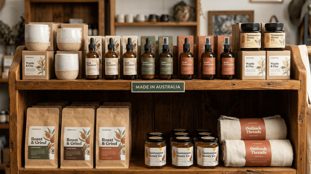
Three decisions carry this whole thing. Format — roll, sheet or individual die-cut, chosen for your volume and for whether an applicator is ever in your future. Fit — measured against the actual container in your hand, with width treated as the constraint it is on anything curved. Volume — ordered with a buffer, ahead of the season rather than during it.
Everything that looks effortless on a shelf is the result of those decisions being made before anyone opened a design file. The labels that sit perfectly flat, line up across a row of jars and still look right after a summer in transit didn’t get there by luck. They got there because someone measured a jar with a strip of paper and thought about February.
Back to that spare room in Bendigo. Same floor, same boxes against the wall — but the jars are labelled evenly, the mailers are sealed, and the reorder for the Christmas run is already placed. That’s the whole ambition: product labels that stop being a problem to solve every few months and quietly become part of how the business runs. You can see the full sticker and label range whenever you’re ready.
You’ve done the planning. Here’s what happens when you’re ready to order.
The process is five steps:
And if your deadline is genuinely tight — a market on Saturday, a wholesale order that moved, a launch date that won’t shift — call the main line and mention “URGENT”. The team will try to find a solution, even outside normal business hours. It’s a real safety net, not a gimmick, and the detail is in rush and urgent orders.
Two ways to start: browse the full sticker and label range, or send through your sizes, quantities and container details and get a quote. If you settled on rolls earlier in this guide, go straight to vinyl sticker rolls or paper sticker rolls.
Custom Stickers Melbourne: The Complete 2026 Guide for Victorian Businesses Picture this: it’s a Thursday afternoon in a Brunswick café. The new logo finally landed
Picture this. It’s Friday night in a suburban Australian street — the kind where the smell of melted cheese and wood-fired dough drifts through open

The Complete Australian Guide for Beekeepers and Honey Producers Picture this: it’s a warm December morning in the Yarra Valley. The flow has been extraordinary

Picture this: it’s 6am on the Saturday before Mother’s Day, and a florist in Melbourne’s inner north is already three hours deep into the morning.

Picture this: it’s a Tuesday night in a sticky-floored pub somewhere in Fitzroy or Fortitude Valley. The lights are low, the monitors are buzzing, and